Text
Usage
The Text component that enables users to display text (String) content.
Behaviour
When the component is active the user should be able to see the written content inside the Text component properties.
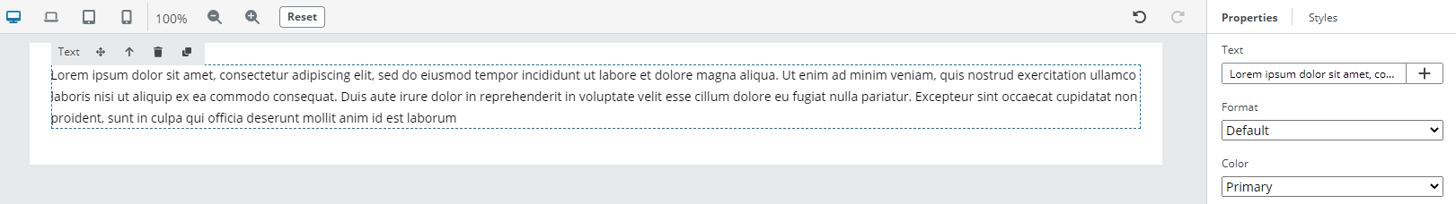
Properties
Text(String) - the text contentFormat(String) - defines the font style of the text. It is possible to choose from:- Allowed values: {
body1,body2,Subheading1,Subheading2,Title,Headline,Caption,Display1,Display2,Display3} - Default:
Default Color(String) - defines the font color of the text, choose from:- Allowed values: {
Primary,Secondary,Read only,Interactive} - Default:
Primary HTML Tag(String) - defines the HTML tag of the text. It is possible to choose from:- Allowed values: {
span,p,h1,h2,h3,h4,h5,h6}- Default:
p
- Default:
Visual styleguide
For more details, refer to the Text Area & Text Input Visual styleguide in our Storybook