App Studio Canvas
Overview
The Canvas is where you design and edit your Apps and consists of the following panes:
- Canvas view
- Layers
- Components
- Toolbar
- Properties grouped into Main, Styles, HTML and Advanced
- Logic map
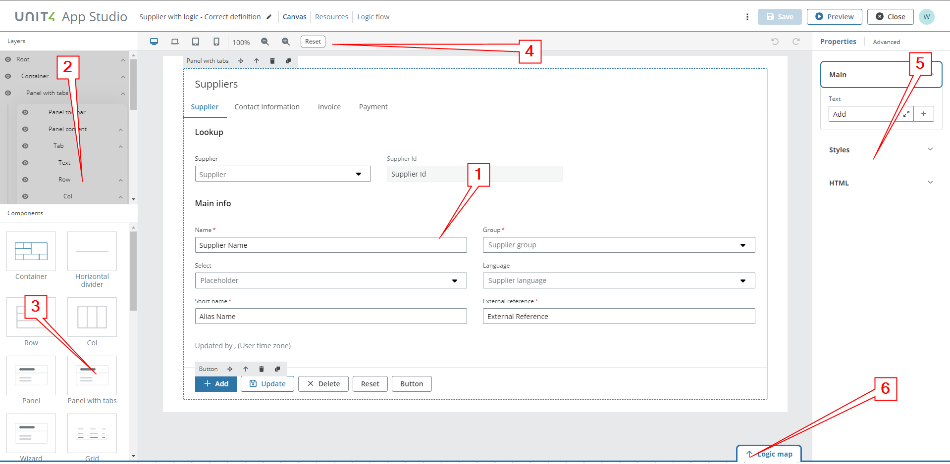
Canvas view
You create and edit content on a canvas using the Canvas view. All associated panels and toolbars are placed around the editable area, which is in the centre of the page. You can drag components from the Components panel onto the canvas and arrange them as required.
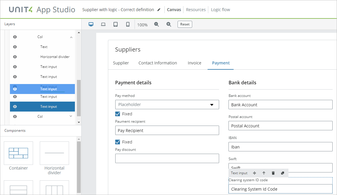
Layers
The Layers panels shows the components used in your app and how they are structured. You can use the Layers panel to:
- Select
- When you select a component in the Layers panel it gets highlighted on the canvas view and its properties become available in the Properties panel
- Rearrange
- You can rearrange components using drag and drop to move them along the Layers panel and the canvas view updates to show the new structure
- Delete
- You can delete components from layers and canvas by pressing
Delete KEY,Backspace KEYor using the trash can icon.
- You can delete components from layers and canvas by pressing
NOTE: You can hide layers and collapse/expand each layer group.
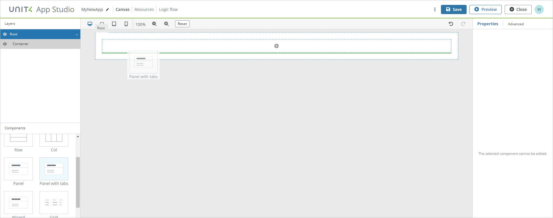
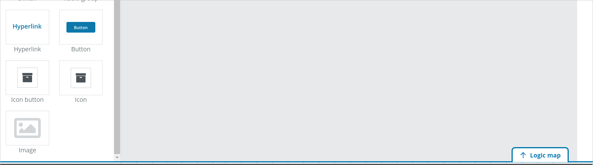
Components
App Studio offers high design flexibility by allowing you to drag and drop elements from the Components panel on to the central Canvas view area. You can build both simple and complex interfaces once you get familiar with how the tool works.
Start using App Studio by dragging components to the canvas and defining their properties and styles. Nested containers can be used to produce more complex layouts.
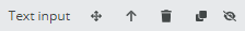
Component toolbar
When you select a component in the Canvas view, a component bar is available with the following options:
- Drag and Drop: Click, drag and then drop an element in order to move it.
- Select parent component: Selects the higher component (the parent element that contains the selected child element).
- Delete: Deletes the selected element.
- Clone: Clones the selected element and all its configuration for faster App editing.
Templating references in components
Components that can be referenced with templating
When using templating (see the Liquid support documentation for more info), it is possible to reference directly to the input of a specific component. The available components to be referenced with templating are:
- Text input
- Text area
- Select
- Select with filtering
- Checkbox
- Switch
- Radio Group
All these components have the property Template ID, that is automatically generated every time you add one of the above components.
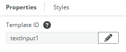
Template IDs
The generated IDs are created with the following pattern:
[componentName][counter].
The counter is incremented for each new component added, for example, [TextInput4],[SelectWithFiltering2].
A Component's input is accessible using ".value", for example, {textInput12.value}.
If the TemplateID is changed in the Template ID field then, to avoid having to manually update them, all the references are automatically updated in all places where templating is allowed.
NOTE: The following fields used in the components below do not get automatically updated since they depend on the Resource selected in the Options field and not in the TemplateID.
- Select/select with filtering: Display field, Value field
- Grid: Display field on a column
- Radio group : Display field, Value field
NOTE: You have the option to modify the ID set by default, but you cannot save an ID if another already exists with the same name.
Canvas toolbar

You use the Canvas toolbar to:
- Resize the Canvas view and reset the size back to 100%
- See how your App renders when running on different device sizes (desktop, laptop, tablet and mobile)
- Undo and redo your edits
Properties
The Properties panel is where you define the various properties and styles that each component or components group can have.
Properties are used to add data and values for the component to use. The properties panel allows you to define how your UI components behave, how they show data and other information, and how they are connected to app data. The Properties appear in the right panel when you select a component.
Components have the following categories:
- Main
- Styles
- HTML
- Advanced
Not all components share all of the same properties, and additionally components have style properties which can be changed inside the styles tab.
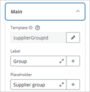
Main properties
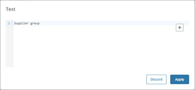
Main properties define the template ID, what title and placeholder text the component has, and input properties to define the default value and which input data is used to populate it. The Properties input fields can also be expanded to make it easier to work with Liquid template development. See Liquid support for more details about working with Liquid templates.
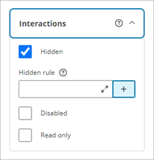
Interactions
The Interactions properties allow you to define rules for when a field is hidden, disabled, or read only. If an interaction rule is set on a component, this is shown in the component toolbar, with the Eye slash icon for Hidden, and the Eye icon for Disabled or Read only as shown below.
Note that if overlapping interactions occur, then the hierarchy is: Hidden > Disabled > Read only. For example, if a component is set as Disabled and Read only at the same time, then the component would only appear as Disabled.
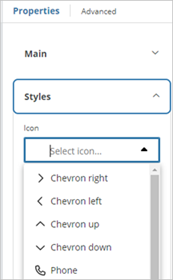
Styles properties
Components have also Styles properties and these are used to define certain field attributes such as the height, width, whether the field appears greyed out, contains an inline label, if a switch is checked by default or a button is enabled or not etc. For the clickable components Button, Icon button and Icon the displayed icon can also be selected.
Validation
The Validation properties allow you to define validation rules for input fields based on common patterns and additional validation rules for required fields, and error, warning and information message conditions. For more details , see Validation.
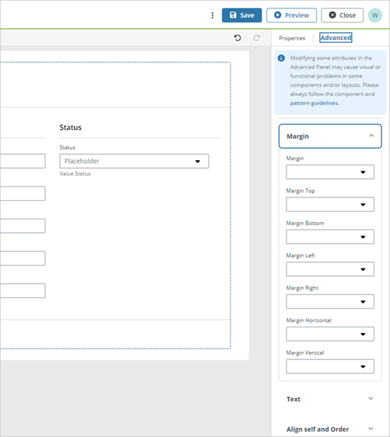
Advanced
Unit4 App Studio components can receive a selection of Bootstrap v4.1 classes for advanced customization purposes and these are presented in the Advanced tab. You can find the supported classes in the Usage Tab of our NextGen Design System.
CAUTION: Modifying some attributes in the Styles Panel may cause visual or functional problems in some components and/or layouts. Please always follow the component and pattern guidelines.
Options
Once you are happy with your App and you want to Publish it, press on the three vertical dots > Publish.
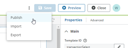
You will be prompted to give an unique name to your App and a URL will be generated.
NOTE: Spaces and special characters (for example, @#$%&,etc.) are not allowed.
If you want to Export your App (as a JSON file), press on the three vertical dots > Export.
You can also select to Import an App (a JSON file) by pressing on the three vertical dots > Import.
Logic map
The Logic map section applies to the clickable components Button and Icon button and allows you to define how they behave when clicked.
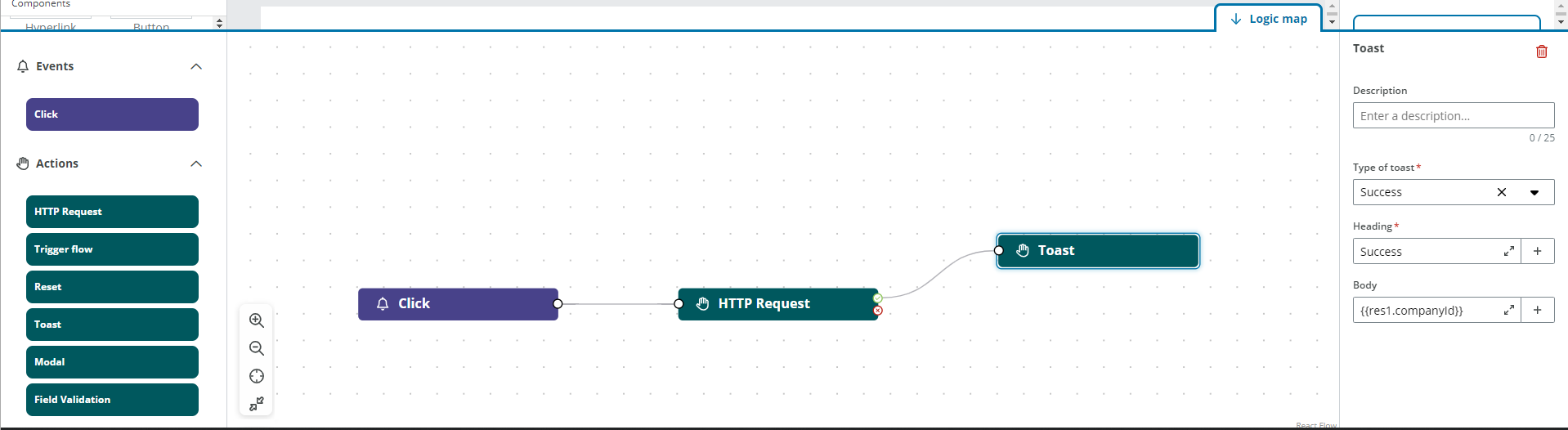
The Logic map window has the controls Zoom in, Zoom out, Fit to content and Maximize.
A clickable component has the Click event and you can define the following actions for this event:
- HTTP Request
- Trigger flow
- Reset
- Toast
- Modal
- Field validation
The Click event has only have one output which leads to the configured action.
See Events and actions for a description of each action.