Grid
Usage
The Grid component is used to organise data into rows and columns to make it easier to see relationships and to facilitate easier understanding. A grid allows the user to compare and check different information aspects without losing the big picture.
Behaviour
The grid component supports viewing and filtering presented data, editing data, adding and deleting rows, and importing and exporting data.
Properties
The following Grid component properties are available:
| Property | Description |
|---|---|
| Main | |
| Template ID | The unique ID of the grid component. |
| Grid data | The array to return the data for the grid. Only an array can be selected as a resource for this component. No options are available if none of the resources return an array. |
| Allow editing | Sets if the grid is editable or not. If set to editable, a kebab menu (three dots) appears with the grid options Add row and Reset Grid Changes. A trash-can icon is also presented next to rows to alow them to be deleted. |
| Enable data import | Enables data to be imported into the grid from an Excel file. The Import Data option is then available in the kebab menu and an Import rows icon is displayed in the grid. 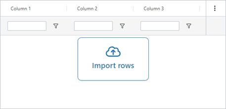 |
| Skip first header row | If selected, when importing data the first row of the Excel file will be treated as the header and not imported. |
| Enable data export | Enables data to be exported from the grid as an Excel file. The Export Data option is then available in the kebab menu. |
| Styles | |
| Grid height | Sets the height of the grid. |
| Show filter row | When selected a filter row is presented to allow filtering on the various columns. 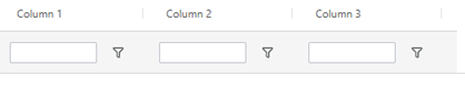 |
| Interactions | |
| Hidden | Sets the grid to hidden. |
| Column | |
| Column ID | This is the unique identifier of the column and is used in Liquid scripts to get hold of each cell's value, for example, grid1.rows[0].name. |
| Title | The column title. |
| Display field | Contains the LiquidJS script/template that populates the column with data. This is typically the name of a column/property in the resource that the grid is bound to, for example {{name}}. |
| Default value | Is the value that is assigned to this column when you add a new row. It can either be calculated from other columns in the grid (using LiquidJS syntax) or be a fixed value. |
| Width | The width of the column. |
| Datatype | Specifies what kind of data that is displayed in the column (text, number, date, etc.). |
| Decimals | Specifies how many decimals are allowed. |
| Hidden | Specifies if the column is hidden or not. |
| Read only | Specifies if the column is read only or not. |
| Disable filter | Specifies if filtering can be done on this column. |
| Disable resize | Specifies if the column can be resized or is a fixed width, |
| Disable sort | Specifies if sorting is allowed on the column. |