Logic events and actions
The Logic flow section on the main toolbar, and the Logic map available in the canvas for clickable components involves configuring actions and events to define the logic behaviour of your app and any clickable components such as buttons. This topic describes the available actions and events.
Events
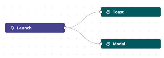
Launch
The Launch event (OnLoad) is available in the Logic flow section and is used to define what happens when your app is launched.
Click
The Click event is available in the Logic map section on the canvas and is used to define what happens when the clickable components Button and Icon button are clicked.
The Click event has only one output which leads to the configured action.
Actions
The following actions are available, listed in alphabetical order:
- Field validation (available in Logic map)
- HTTP Request (available in Logic flow and Logic map)
- Modal (available in Logic flow and Logic map)
- Reset (available in Logic map)
- Toast (available in Logic flow and Logic map)
Field validation
The Field validation action is available in the Logic map section for a clickable component, and allows you to define at what point field validation is applied in the logic, and on which input field by selecting the field ID in the Fields drop-down list. The validation rules for the field are defined using the input field Validation properties. For more details on defining validation, see Validation.
HTTP Request
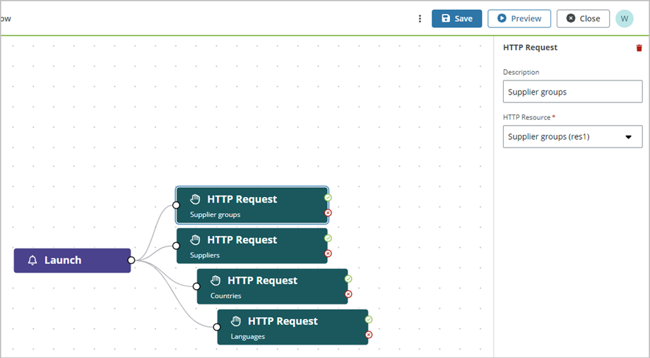
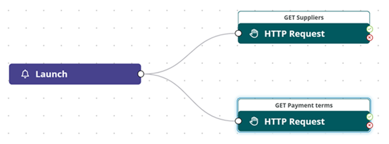
The HTTP Request action is available in the Logic flow section on the main toolbar and in the Logic map section for a clickable component, and links a REST API operation (GET, POST, PUT, PATCH, GET, DELETE) that is defined in the Resources section to the Launch event or the Click event for a clickable component. In the example below, four HTTP Request actions are linked to the Launch event such that Supplier groups, suppliers countries and languages are loaded when the app is launched. Four resources are created in the Resources section with the necessary REST API operations defined.
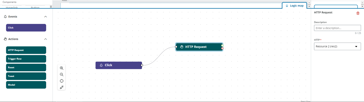
In the example below an HTTP Request is linked to the Click event for an + Add button, and when the button is clicked, the HTTP request is triggered for a POST operation to add a supplier.
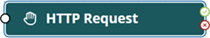
HTTP Request nodes have one input and two outputs, success output denoted with a green tick and error output denoted by a red cross as shown below:
The HTTP Request action has the following properties:
- Description: An optional description of your action
- Resource: A mandatory selector with all the available HTTP resources as defined the Resources section
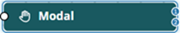
Modal
The Modal action is available in the Logic flow section on the main toolbar and in the Logic map section for a clickable component, and allows you to include information modals in the logic flow in cases that require a response from the user, such as a confirmation, before the logic flow continues.
Modal nodes have only one input (one entry dot) and can have zero, one or two outputs depending on if the modal is set to have one or two buttons.
The Modal action has the following properties:
Modal
- Description: An optional description of the modal
- Number of buttons: Sets if the modal has one or two buttons
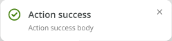
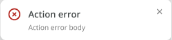
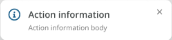
- Type of modal: A mandatory selector to set the kind of message you want to show. The type of messages are:
- Success
- Error
- Information
- Warning
- Heading: A mandatory text input field to enter the text displayed in the modal. Templating is supported (templating is replaced when a field ID is updated). Depending on the type of message you select, the name of it will be added to the field. If you define a custom text, it won't be overridden.
- Body: A text area field to enter the body of the modal. Liquid templating is supported (templating is replaced when a field ID is updated).
Primary button / Secondary button - Close button: Sets if the button closes the modal window - Type: Sets if the button is Highlight or Negative. This sets the button placement with the Highlight button placed to the left of the Negative button. - Button text: Mandatory text to be displayed in the button.
Modal with one button
If you configure the modal window with one button, then only the primary button is available and is set by default as Highlighted, and the Close button setting is enabled with the button text Dismiss. If you choose to disable the Close button setting, then the modal has one output to connect another action that will be triggered when the button is clicked.

Modal with two buttons
If you configure the modal to have two buttons, then both the primary and secondary buttons are available. The secondary button set to close the modal as default and one output is present to connect an action for the primary button, for example, an HTTP Request to post or fetch data. If you disable the Close button setting for the secondary button, then two outputs are present to connect an action for each button.
Changing the number of modal buttons
If a modal with one button and one output is updated to have two buttons and two outputs, then the existing output link is set as the primary option.
If a modal with two buttons and two outputs is updated to have only one button and one output, then the primary option link is kept as the one to be used, and the secondary option link is removed.
Reset
The Reset action is available in the Logic map section for a clickable component, and is used to configure the button such that when clicked it resets the status of the form to the status when it is loaded, meaning that it clears all the information the user has added but still displays the information that was set to be shown as default.
Toast
The Toast action is available in the Logic flow section on the main toolbar and in the Logic map section for a clickable component, and allows you to display information in a toast message. Toast messages are at the top-right corner of the window and are intended to be an unobtrusive way to display information to the user.
Toast nodes have only one input (one entry dot) and no output. The Toast action has the following properties:
- Type of toast: A mandatory selector to set the kind of message you want to show. The types of messages are:
- Success
- Error
- Information
- Warning
- Description: An optional description of the action. This description is not displayed in the Toast message.
- Header: A mandatory text input field to enter the text displayed in the toast. Templating is supported (templating is replaced when a field ID is updated). Depending on the type of message you select, the name of it will be added to the field. If you define a custom text, it won't be overridden. If the text of the Heading is too long, only the first three lines are shown in the toast and the text is truncated with an ellipsis (...). Hovering over the text shows the rest of the Heading.
- Body: A text input field to enter the body of the modal. Templating is supported (templating is replaced when a field ID is updated). If the text of the Body is too long, only the first couple of lines are shown in the toast and the text is truncate with an ellipsis (...). A Read more / Read less button appears to display and hide the complete text when clicked.
Only one toast message can be displayed at a time. Toasts must be manually dismissed unless a new toast is displayed in the window and the new one will replace the previous one.
Rules for actions
The following applies to actions:
- Concatenation of actions is allowed for the HTTP Request and Modal in cases where you use a two button modal.
- Linking an output to an input of the same action is not allowed.
- Infinite loops with a connection between the last action of a flow and the first one of the same flow is not allowed.
Launch order of actions set in parallel
When you set HTTP Request actions in parallel, all requests are launched simultaneously.
If you set Modal and Toast actions in parallel, the last one added is shown regardless of how the actions are placed above or below each other.