Chart
The Chart component is a data visualization element that allows you to:
- Display data in various chart formats including bar, line, pie, doughnut, and radar charts.
- Create interactive dashboards and data-driven windows.
- Visualize data from resources or use hardcoded data for testing.
Charts are an important feature for the user experience:
- Use charts to communicate data insights to users visually.
- Use different chart types to represent different types of data relationships.
- Use datasets to compare multiple data series in a single chart.
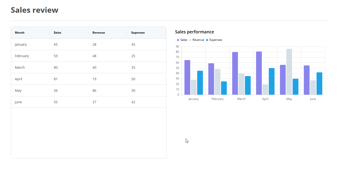
Example
You can use the Chart component to create dashboard window that displays data from API resources or hardcoded values for prototyping.
In this example, users can visualize sales data on table and chart formats.
Note: The Chart component follows the WCAG 2.0 AA accessibility guidelines.
Properties
The following Chart component properties are available:
Main properties
The following table describes the main properties of the component.
| Property | Description | Required |
|---|---|---|
| Label | Enter the name you want to be displayed above the component. | Yes |
| Type | Select the chart type from the drop-down: bar (default), line, pie, doughnut, or radar. | Yes |
| Main axis label | Select a resource containing the main axis labels. Only available for bar, line, and radar chart types. You must use an array of strings. For example, ["label 1", "label 2"]). |
No |
| Legend label | Select a resource containing the legend labels. Only available for pie and doughnut chart types. You must use an array of strings. For example, ["label 1", "label 2"]. |
No |
| Dynamic datasets | Turn on the switch to configure datasets using a resource that returns an array of dataset objects. When enabled, the Datasets field is displayed and the Datasets menu is hidden. | No |
| Datasets | Enter or select a resource containing an array of dataset objects. Each object must include a label (string) and data (array of numbers). For example: [{"label": "dataset 1", "data": [42, 78, 15]}, {"label": "dataset 2", "data": [34, 87, 12]}]. Only visible when Dynamic datasets is enabled. |
No |
Datasets properties
The following table describes the datasets properties of the component.
The Datasets accordion is hidden when the Dynamic datasets switch is enabled in the Main properties.
| Property | Description | Required |
|---|---|---|
| Add dataset | Select the Plus(+) button on the Datasets menu to add a new dataset to the chart. By default, one dataset is created. | No |
| Legend | Enter the legend name for the dataset. Displays for bar, line, and radar chart types. | Yes |
| Label | Enter the label name for the dataset. Displays for pie and doughnut chart types. | Yes |
| Data | Select a resource containing the dataset values. You must use an array of strings or numbers. For example, ["40", "80"] or [40, 80]. If data is not loaded or returns null, the chart displays [0] as fallback. |
Yes |
| Delete dataset | Select the Trash can icon to remove the dataset. This button is hidden when only one dataset remains. | No |
Note: You can reorder datasets using drag and drop.
Styles properties
The following table describes the styles properties of the component.
| Property | Description | Required |
|---|---|---|
| Orientation | Select the chart orientation from the drop-down. Only available for bar and line chart types. | No |
| Stacked | Turn on to stack the datasets. Only available for bar and line chart types. | No |
| Fill | Turn off to remove the filled area under the line. Only available for line and radar chart types. | No |
Note: The Styles properties do not display for pie and doughnut chart types.
Note: The Align property in Columns is set to Stretch by default, so the component will take all the available width. To change that, set the Align property to Left, Center or Right.
Interactions properties
The following table describes the interactions properties of the component.
| Property | Description | Required |
|---|---|---|
| Hidden | Select the checkbox to hide the component in the end-user app. To hide it in the canvas, use the eye icon in the Layers panel. | No |
| Add rule | You can set rules to hide the component using Liquid JS. If no rules are set, the component will be hidden in all instances. | No |
Note: See Add rules to trigger properties for more information on setting rules for these properties.