Root
The Root component is the top-level container for your app and provides the foundational layout structure.
Example
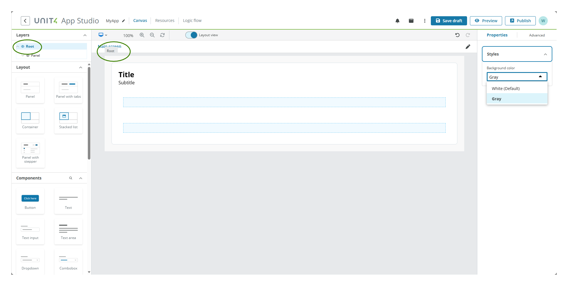
The Root component serves as the main wrapper for all other components in your app. You can customize its background color to set the overall appearance of your application.
Note: The Root component follows the WCAG 2.0 AA accessibility guidelines.
Properties
The following Root component properties are available:
Styles properties
The following table describes the styles properties of the component.
| Property | Description | Required |
|---|---|---|
| Background color | Select a background color for the root container from the drop-down. | No |
Selecting the Root component
Since there is only one Root component per app, you can select it in two ways:
- Select the component in the Layers panel.
- Select it on the canvas background area.
Note: The Root component cannot be moved or deleted, and no drag and drop operations are available for this component.