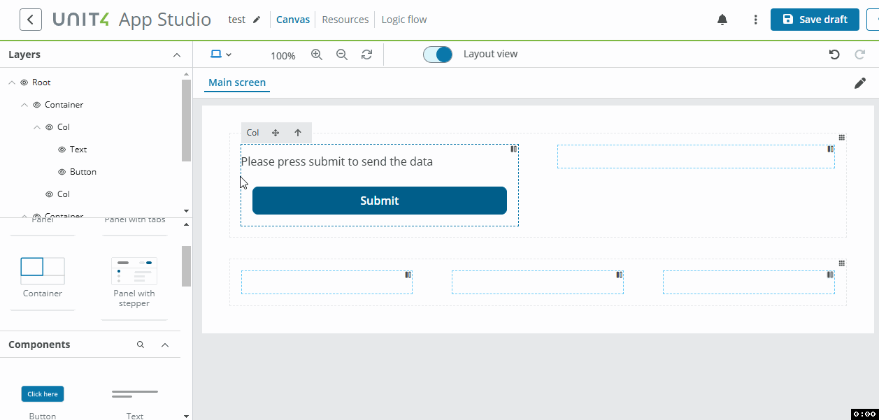
Container
The Container component is a basic layout element and is used to horizontally align the layout of your window components using columns. The Container is based on a grid system with 12 columns.
The Container:
- Can be placed inside other components, such as columns inside other Containers, Panels and Panels with tabs to align components horizontally.
- Adapts to different screen sizes.
- Width can be fluid (100% of its parent) or fixed.
Note: Only the Vertical divider component can be added directly in the Container component.
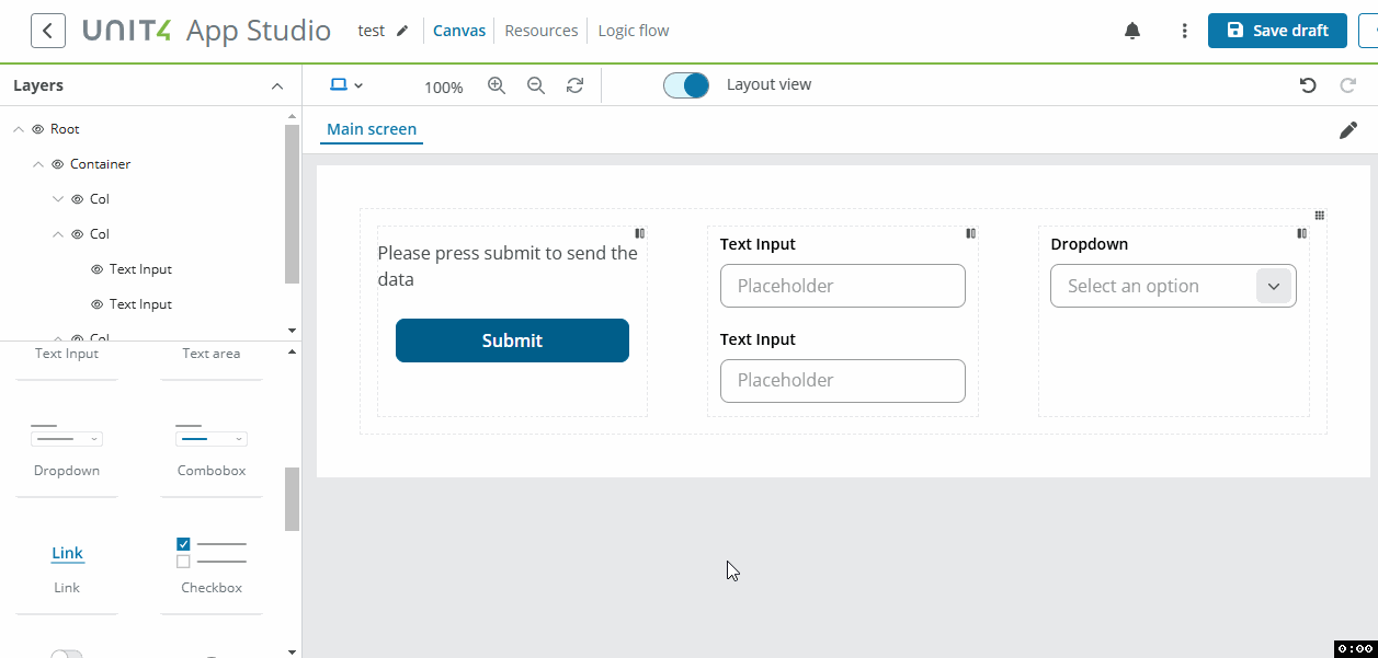
Example
You can use the Container component to create a card-style layout. The example below shows:
- One Container with 1 column and Gray background, containing:
- One Container with 2 columns at 4/8 span, White background and Card variant, containing:
- Column 1 (4 span): Text input component.
- Column 2 (8 span): One Container with 2 columns at 6/6 span, containing:
- Left: Three stacked components.
- Right: One component.
- One Container with 2 columns at 4/8 span, White background and Card variant, containing:
Properties
The following Container properties are available:
Main properties
The following table describes the main properties of the component.
| Property | Description | Required |
|---|---|---|
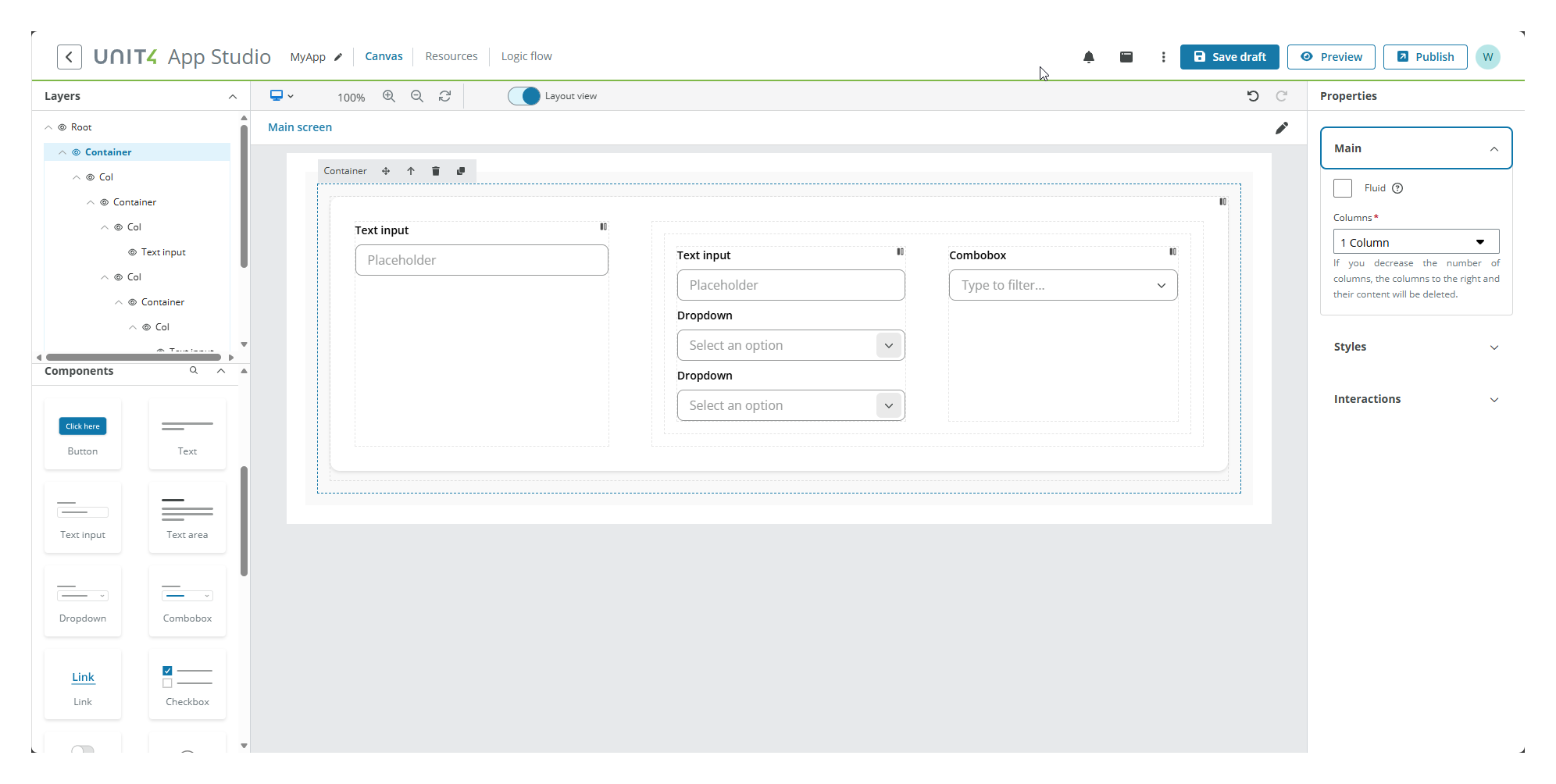
| Fluid | Select the checkbox to make the container cover the full width of the browser window, even if resized, with no margins on the left or right side. | No |
| Columns | Select the number of columns for the Container. See Columns for more details. | Yes |
| Column [number] span | Select the span for the specified column. There are as many fields as number of columns selected. See Customizing column span for more details. Note: Not available for 1 and 12 columns layouts. |
Yes |
Styles properties
The following table describes the styles properties of the component.
| Property | Description | Required |
|---|---|---|
| Background color | Select a background color for the container from the drop-down. | No |
| Variant | Select a variant style for the container from the drop-down. To follow UX guidelines, if using the Card variant, you must place the Container component inside a Layout component with gray background. |
No |
Interactions properties
The following table describes the interactions properties of the component.
| Property | Description | Required |
|---|---|---|
| Hidden | Select the checkbox to hide the component in the end-user app. To hide it in the canvas, use the eye icon in the Layers panel. | No |
| Add rule | You can set rules to hide the component using Liquid JS. If no rules are set, the component will be hidden in all instances. | No |
Note: See Add rules to trigger properties for more details on how to set rules to the property.
Columns
Columns are used to divide the app into vertical sections into which you place the various components. The Container has the following column options:
- 1 column - (default)
- 2 columns
- 3 columns
- 4 columns
- 6 columns
- 12 columns
Customizing column span
For containers with 2, 3, 4, or 6 columns, you can customize the width of each column by specifying the column span. The total span across all columns must equal 12 (based on the 12-column grid system).
Column [number] span input fields:
When you select 2, 3, 4, or 6 columns, input fields appear in the Main properties menu allowing you to specify the span for each column:
- Column 1 span, Column 2 span, etc.
- Each input accepts a number between 1 and the maximum available span (13 minus the number of columns).
- The sum of all column spans must equal 12.
Default column spans:
| Number of columns | Default spans |
|---|---|
| 2 columns | 6/6 |
| 3 columns | 2/8/2 |
| 4 columns | 3/3/3/3 |
| 6 columns | 2/2/2/2/2/2 |
Automatic adjustment:
When you change the span of any column except the last one, the last column's span automatically adjusts to ensure the total equals 12. If the combined total of all column spans does not equal 12, an error message appears.
Note:
Column properties
The following Column properties are available when you select a column in the Canvas:
Main properties
The following table describes the column properties of the component.
| Property | Description | Required |
|---|---|---|
| Distribute | Choose from the drop-down how to distribute the different components inside your column. | No |
| Align | Choose from the drop-down how to align the different components inside your column. | No |
| Vertical gap | Select a spacing token from the drop-down. It sets a vertical space between components in the same column. | No |
Drag
- The example below shows content being moved from one column to another:
- The example below shows columns being rearranged within their parent container.