Canvas
Overview
The Canvas is where you design and edit your apps. It contains the following elements:
- Main toolbar
- Canvas toolbar
- Canvas viewport
- Layers
- Layout
- Components
- Properties
- Advanced
- Logic map
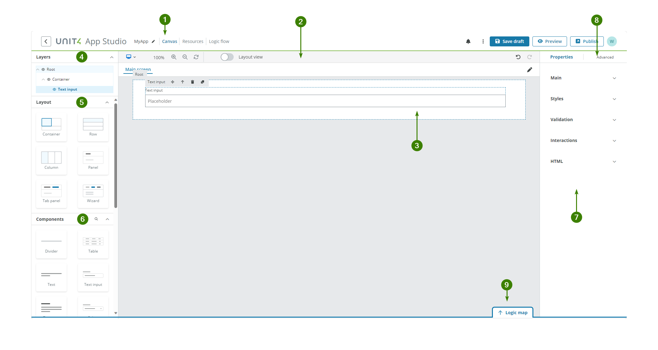
1. Main toolbar

The main toolbar allows you to:
- Return to the App Studio dashboard.
- Edit the app's name.
- Switch between the Canvas, Resources and Logic flow tabs when creating your app.
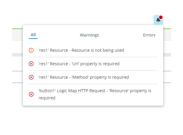
- See warnings and error messages in the Notification panel.
- Import an app in JSON format and export the current app as a JSON file.
- Save your app as a draft.
- Preview your app.
Note: If the preview does not open in a new tab after a few seconds, you might have the block pop-ups feature turned on in your browser. Allow pop-ups to fix the issue.
- Publish the current app.
- Manage credentials.
2. Canvas toolbar
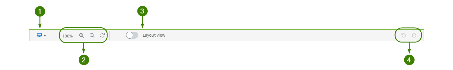
You can use the Canvas toolbar to:
- See how your app renders when running on different device sizes (desktop, laptop, tablet and mobile).
- Resize the Canvas viewport and reset the size back to 100%.
- Turn on/off the grid using the Layout view switch.
- Undo and redo your edits.
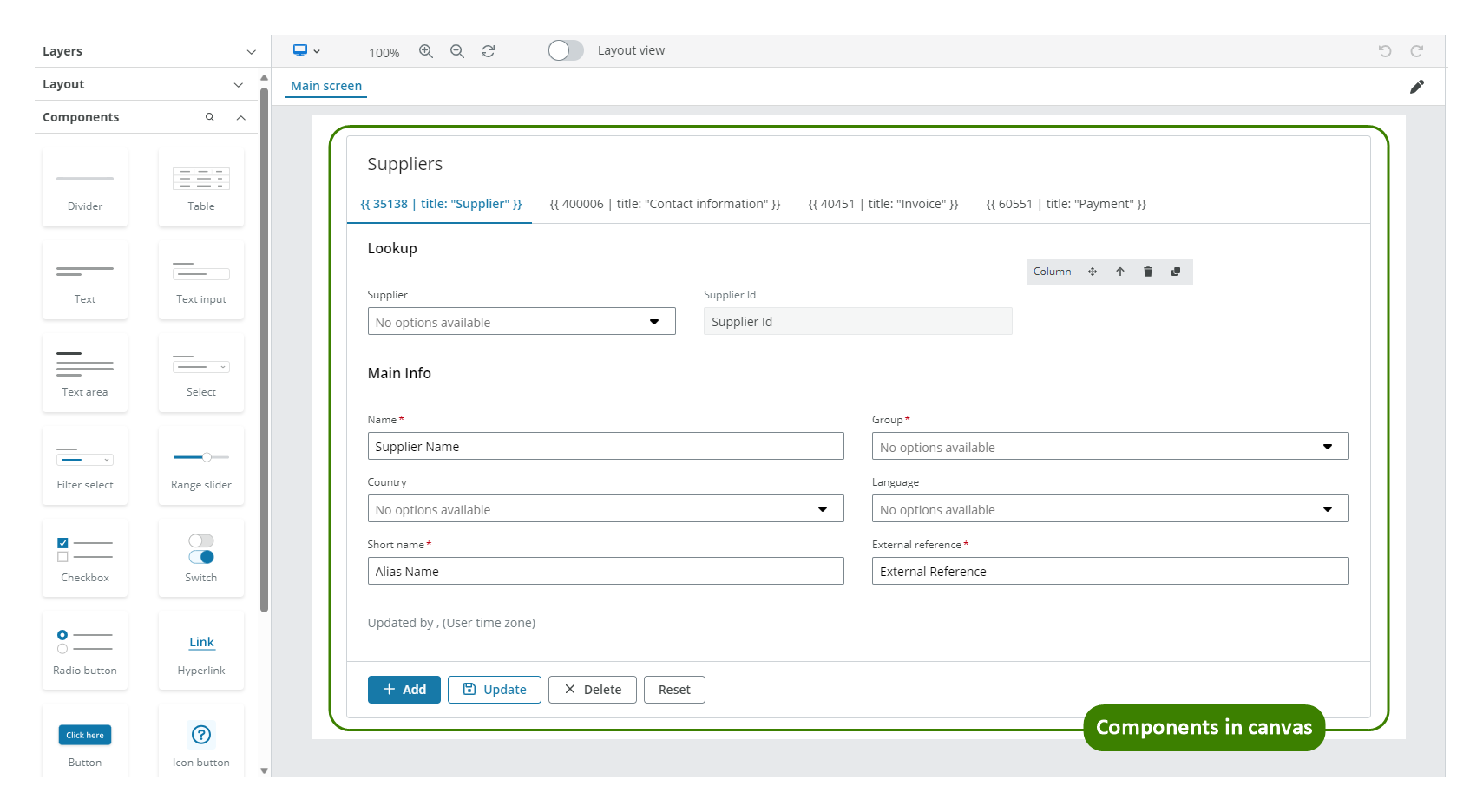
3. Canvas viewport
You create and edit content on a canvas using the Canvas viewport. All associated panels and toolbars are placed around the editable area, which is in the centre of the page. You can drag-and-drop components from the Layout and Components panels onto the viewport and arrange them as required.
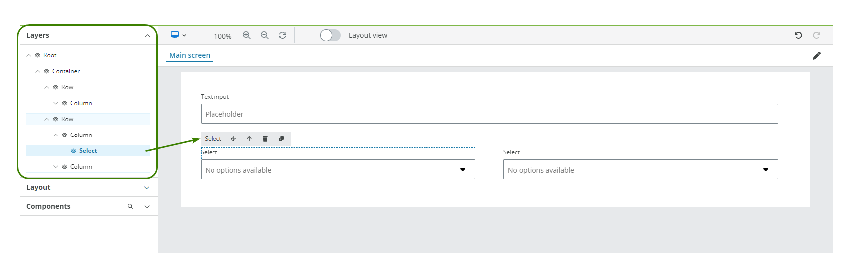
4. Layers
The Layers panel shows the components used in your app and how they are structured. You can:
- Select a component in the Layers panel. The component gets highlighted on the Canvas viewport and its properties become available in the Properties panel.
- Rearrange components using drag-and-drop to move them along the Layers panel. The Canvas viewport updates to show the new structure.
- Hide the component in the Canvas viewport by selecting the Eye icon.
- Expand/collapse each layer group by selecting the Chevron icon.
- Delete components from Layers by pressing the Backspace key. The component is also deleted in the Canvas viewport.
5. Layout
The Layout panel contains components specifically designed to help you structure and align content in your app. Drag-and-drop these components to create your app. There are two categories of Layout components:
- Basic Layout components used to align content in a grid: Container, Row and Column.
- Advanced Layout components used to help with more advanced configurations and functionality: Panel, Tab panel and Wizard.
Note: See components and how to edit an app for more details.
6. Components
The Components panel contains components with different functionalities. Drag these components to previously added Layout components in the Canvas viewport and define their properties and styles.
Note: See components and how to edit an app for more details.
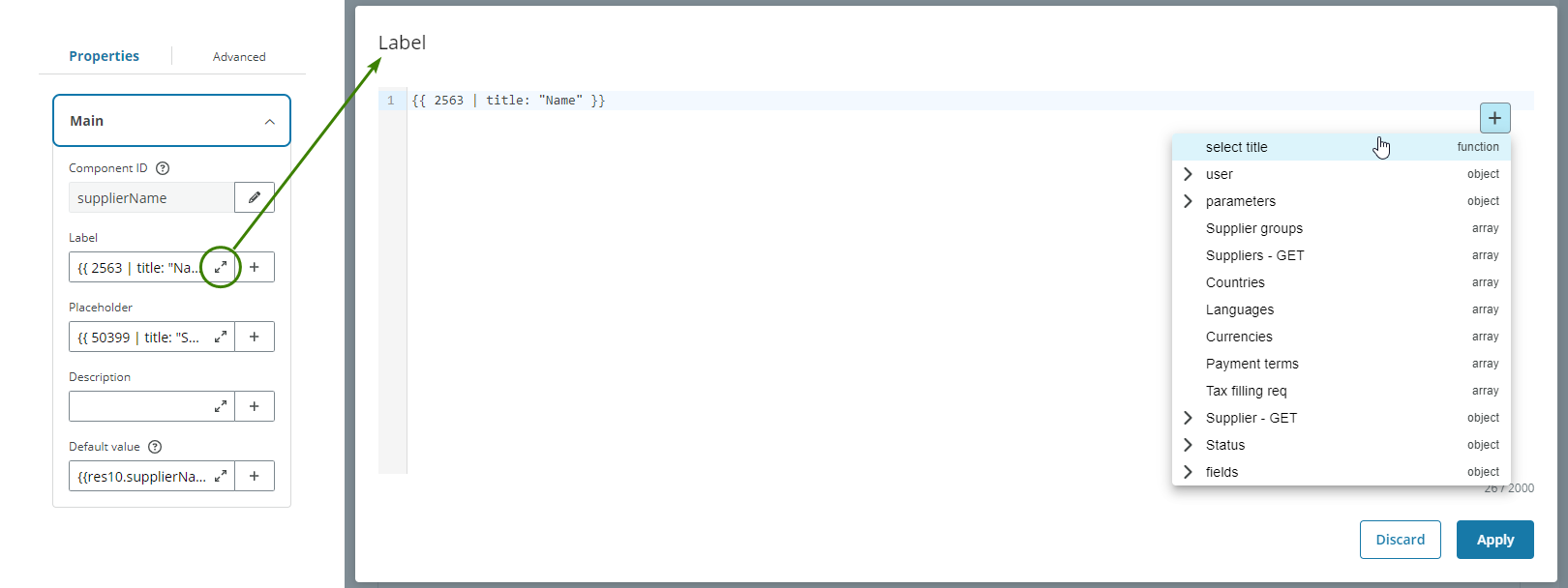
7. Properties
The Properties panel allows you to define how your components look and behave, how they show data and other information, and how they are connected to the app data. The Properties appear in the right panel when you select a component.
Component properties have the following categories:
Note: Not all components share the same properties. Read each component's documentation for more details on their properties.
Main
The Main properties define the Component ID which can be used for templating (see Templating dropdown) and other properties that allow you to define which input data is required or is used to populate it. Read each component documentation for more details.
The fields can be expanded for editing.
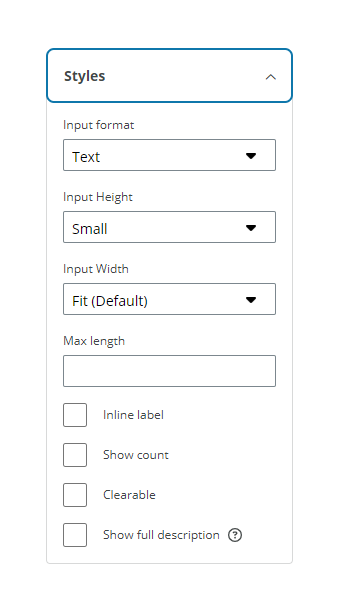
Styles
The Styles properties are used to define certain field attributes such as the height or width, if a switch is checked by default or which icon to display. Read each component documentation for more details.
Validation
The Validation properties allow you to:
- Set the component as required and add a rule to specify when the component is required.
- Define validation rules for input fields based on common patterns.
- Set additional validations rules for error, warning and informative conditions.
- Enter messages for required fields and error, warning and informative conditions.
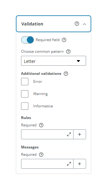
Note: See Validation for more details on validation properties and see add rules to trigger properties for more details on setting rules to these properties.
Interactions
The Interactions properties allow you to set to read only, hide or disable a component. You can also add rules to specify when a component is hidden, disabled, or read only. See add rules to trigger properties for more details.
The Component toolbar displays an Eye icon when a component is set to disabled or read only and an Eye slash icon for hidden.
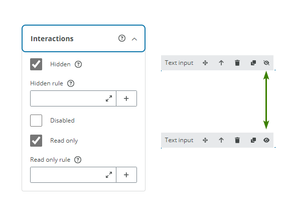
Note: If overlapping interactions occur, then the hierarchy is: Hidden > Disabled > Read only. For example, if a component is set as Disabled and Read only at the same time, then the component would only appear as Disabled.
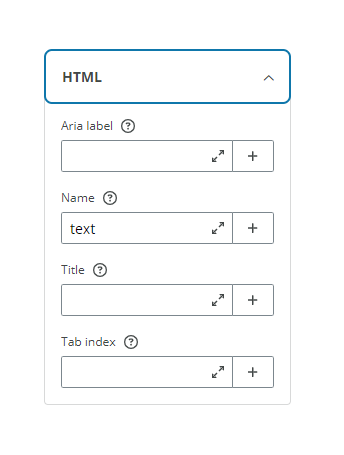
HTML
The HTML properties allow you to add certain HTML tags that are passed and attached directly to the source code of the app. Read each component documentation for more details.
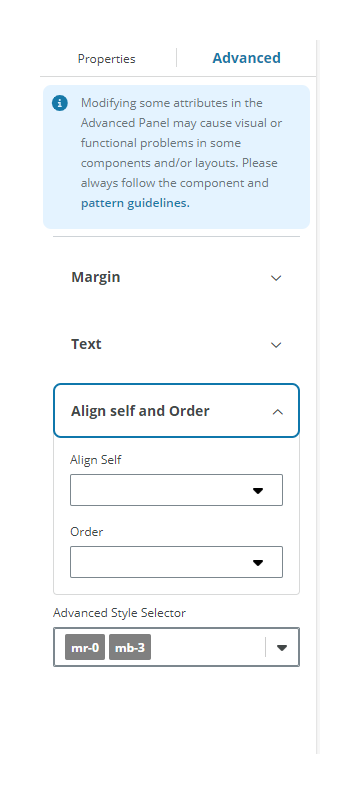
8. Advanced
The Advanced panel allows further customization of components that receive a selection of Bootstrap v4.6 classes. You can find the supported classes in the Usage section of each component in our NextGen Design System.
Caution: Modifying some attributes in the Styles section may cause visual or functional problems in some components and/or layouts. Please always follow the component and pattern guidelines.
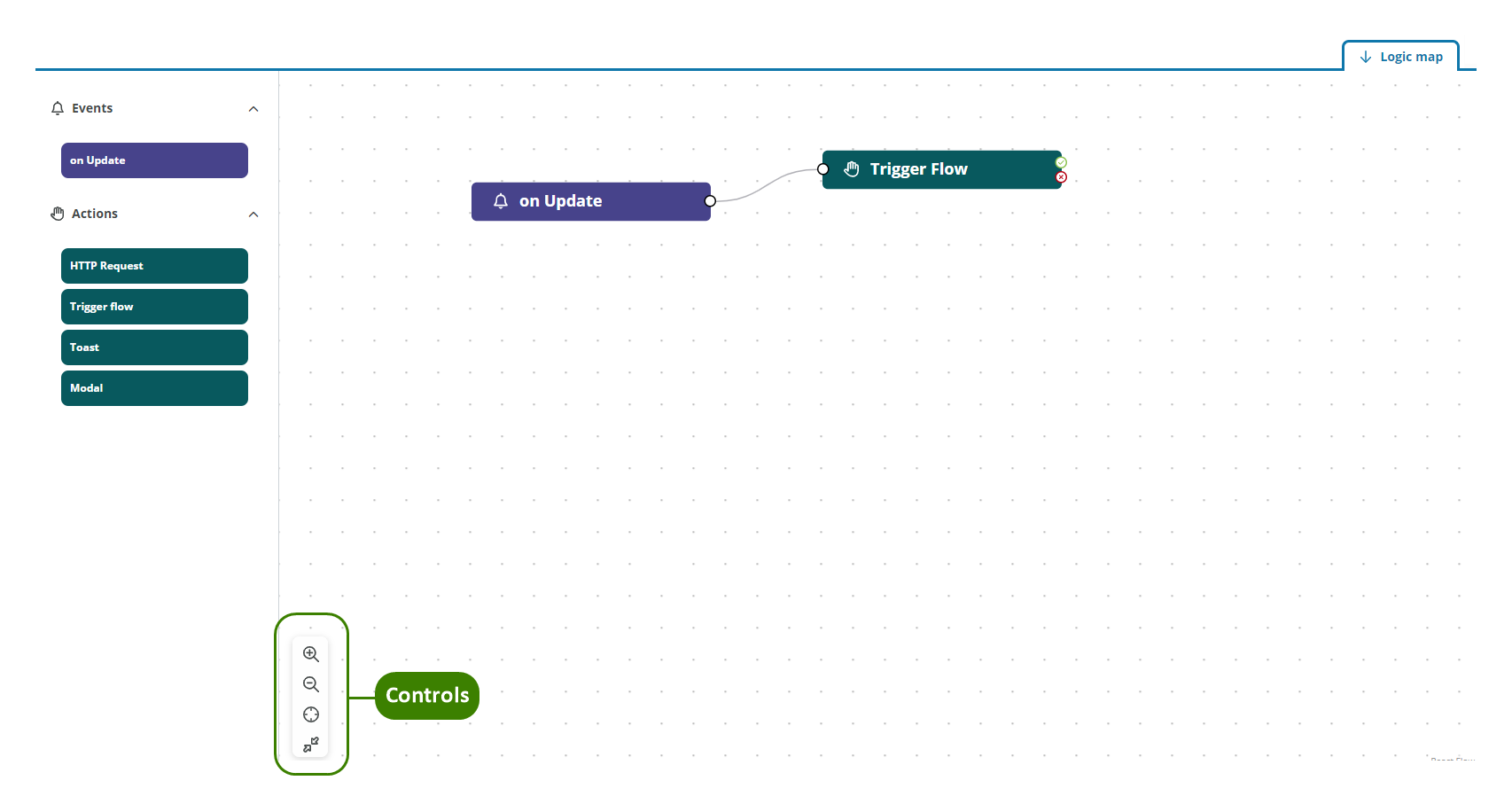
9. Logic map
The Logic map section is available in every component that supports events. See events and actions for more details.
The viewport has the controls Zoom in, Zoom out, Fit to content and Maximize.