Basic layout components
There are three basic Layout components used to layout and align content:
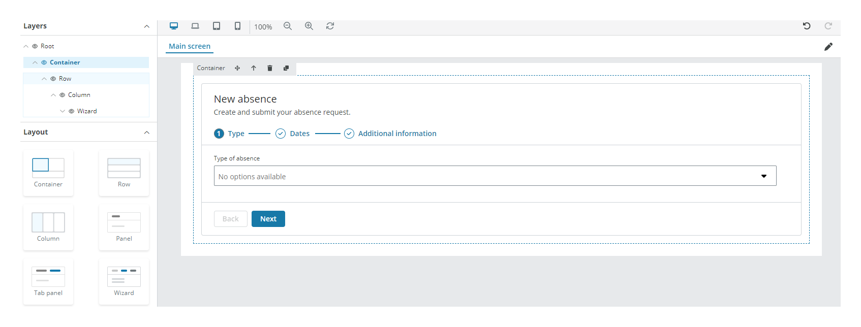
Container component
Containers are the most basic layout component and are used to contain or group different components within a section. The component:
- Is built using Flexbox and adapts to different screen sizes.
- Allows you to select either a responsive container with variable maximum widths at each breakpoint, or a fluid-width container that spans 100% of the available width.
- Can be nested, but most layouts do not require a nested container.
- Can display content, but the best practice is to place rows inside the container, columns within rows and content within columns.
Row component
Rows must be placed within a container to:
- Create proper alignment and padding.
- Create horizontal groups of columns.
Column component
Columns must always be placed inside rows. The component:
- Divides the view horizontally, with a recommended maximum of 20 columns per row.
- Has horizontal padding for controlling the space between them.
- Visually aligns all the content down the left side.
- Without a specified width will automatically layout as equal width columns.
Note: See how to edit an app for more details on how to start editing an app with these components.
Properties
The Row and Column components have no properties. The following Container component properties are available:
Main
| Property | Description |
|---|---|
| Fluid | Select the checkbox to make the container cover the full width of the browser window, even if resized, with no margins on the left or right side. |
Interactions
| Property | Description |
|---|---|
| Hidden | Select the checkbox to hide the component in the end-user app. You can set rules to hide the component using Liquid. The rules are available only when hiding the component with the checkbox, not when hiding the component from the canvas with the Eye icon in the Layers panel. |
Note: See add rules to trigger properties for more details on how to set rules to the property.