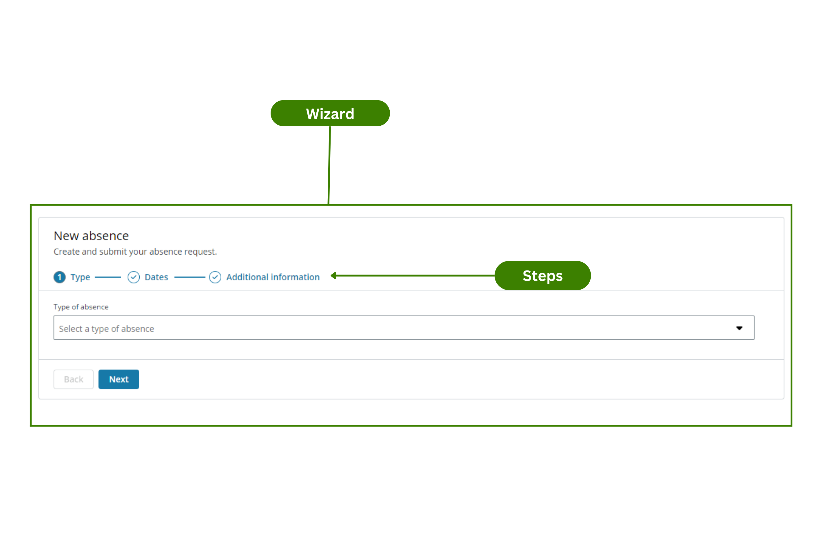
Wizard
The Wizard component is a step-by-step component that enables users to enter information in a predetermined order.
When the component is active the user:
- Can enter, edit and see data for each step.
- Can move back and forth using the Back and Next buttons.
- Can end the process by selecting the Finish button once they reach the last step. See Events for more details.
Example
You can use the Wizard component to create an app where the user must follow certain steps to request an absence. In this example:
- Users select the type of absence.
- Users select the dates.
- Users add additional information and/or attach documents.
- Users upload the information.
Note: The Wizard component follows the WCAG 2.0 AA accessibility guidelines.
Configuration example
This example shows how to configure the New absence app (see Example of usage). Follow these steps to configure it:
-
Drag the Wizard component to the canvas.
-
Select the Wizard component in the canvas and go to the Properties panel.
-
Open the Main menu and configure:
- Component ID: Enter a meaningful name and select the Save button.
- Title: Enter the text you want to appear at the top of your component. For this example, 'New absence'.
- Subtitle: Enter the text you want to appear under the Title. For this example, 'Create and submit your absence request'.
-
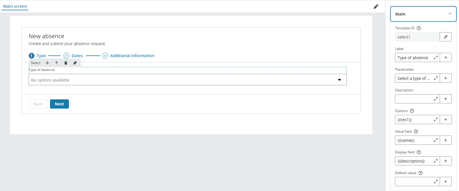
Open the Steps menu. Create three steps using the Add steps (+) button and configure:
-
Step 1:
- Step title: Enter the name for the step. For this example, 'Type'.
- Do not select any checkboxes.
- Select the first step in the canvas.
- Drag a Select component. See configuration example for more details.
-
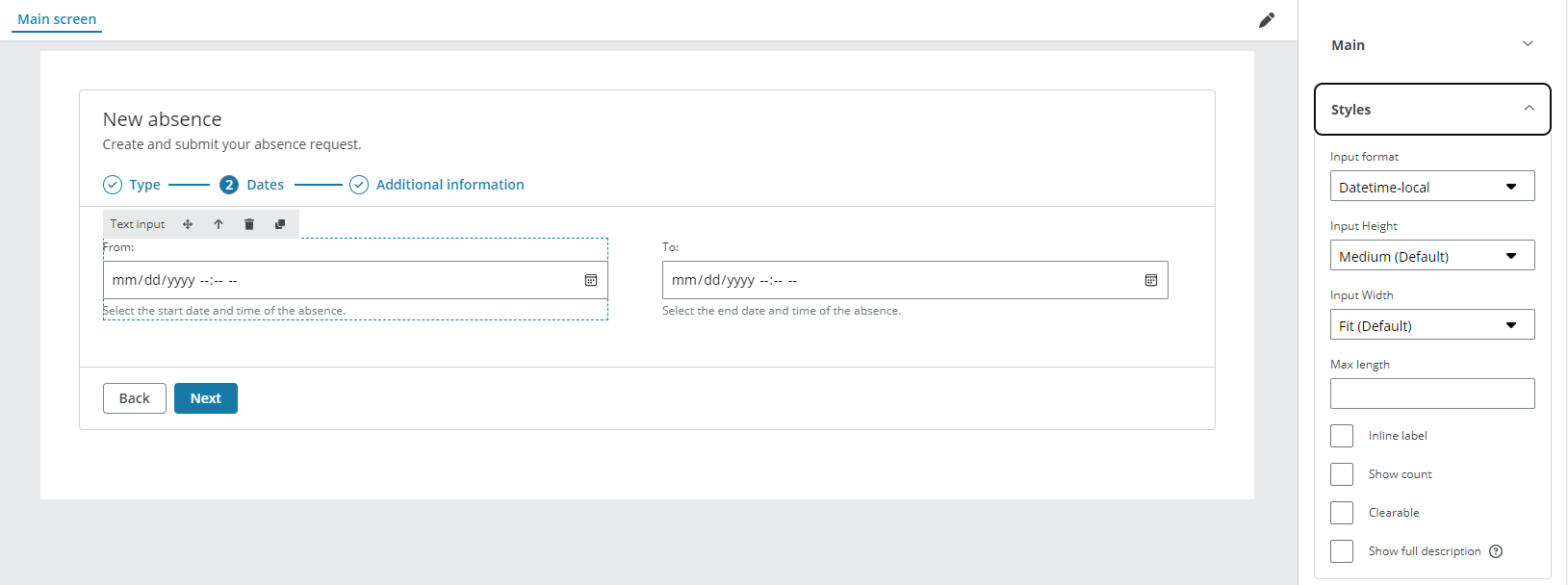
Step 2:
- Step title: Enter the name for the step. For this example, 'Dates'.
- Do not select any checkboxes.
- Select the second step in the canvas.
- Drag a Row and two Column components inside the Wizard component.
- Drag two Text input components to each of the Column components and select Datetime-local from the Input format dropdown. See configuration example for more details.
-
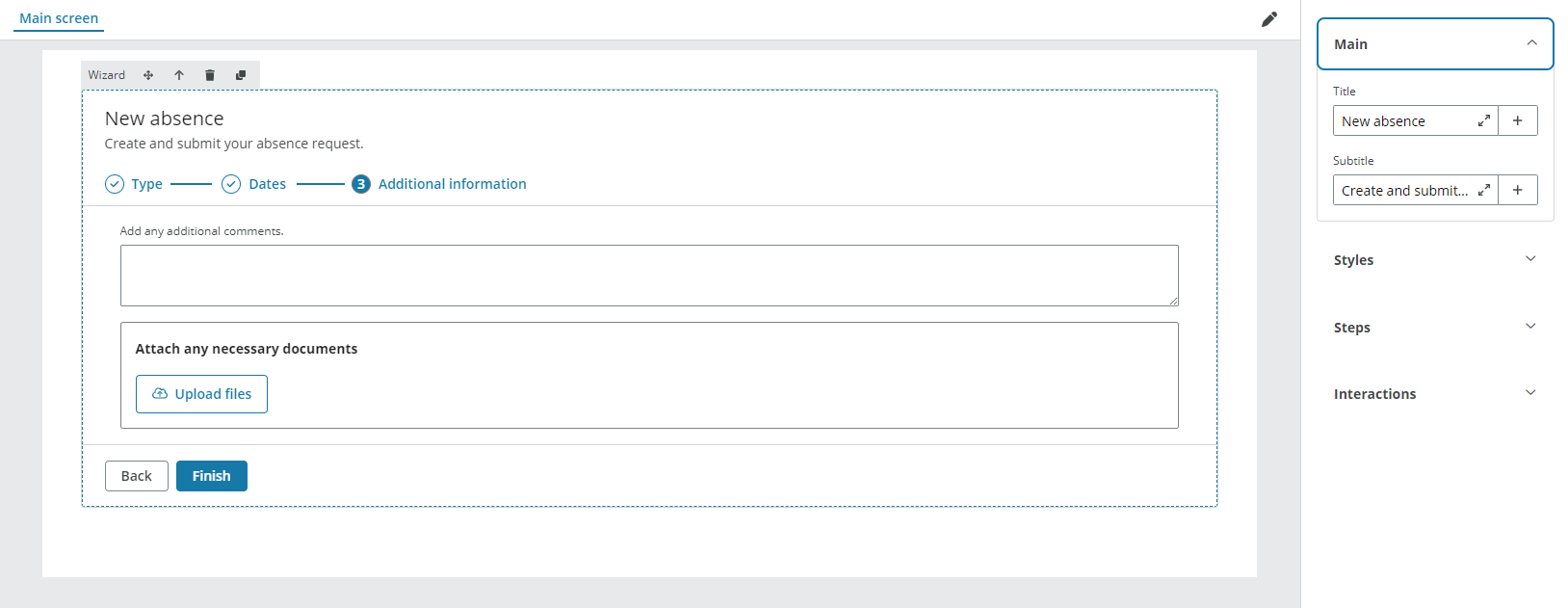
Step 3:
- Step title: Enter the name for the step. For this example, 'Additional information'.
- Do not select any checkboxes.
- Select the third step in the canvas.
- Drag two Row components inside the Wizard component.
- Drag a Text area component and a File uploader component to each of the Row components. See file uploader configuration example for more details.
-
-
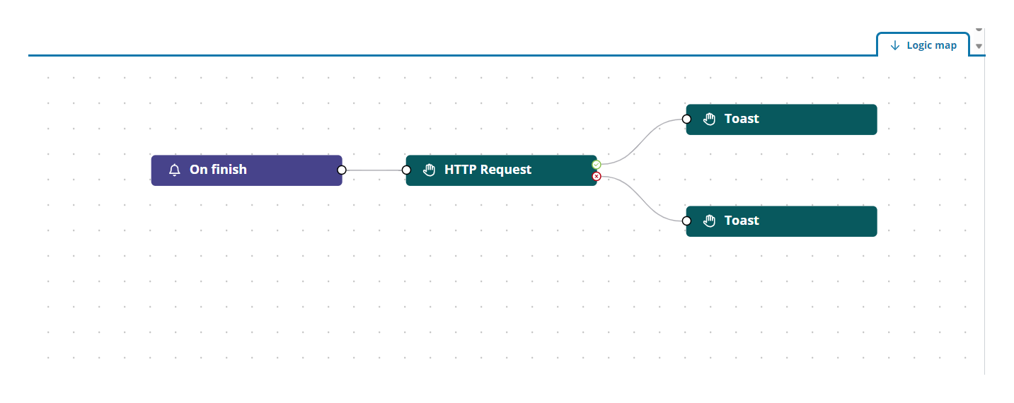
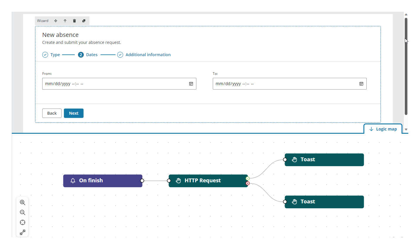
Open the Logic map tab in the bottom right corner to configure the Finish button. Follow these steps:
- Drag the On finish event to the viewport.
-
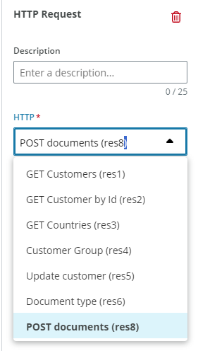
Drag the HTTP request action to the viewport and connect it to the event output port. Select the Resource where you have configured the API call from the HTTP dropdown in the right panel. You must edit all your resources in the Resource tab.
-
Drag two Toast actions to the viewport. Connect them as shown in the picture and configure the Type of toast, the Heading and enter a text in the Body.
Note: Only the properties relevant to the example are explained.
Properties
The following Wizard component properties are available:
Main
| Property | Description |
|---|---|
| Component ID | Enter a unique name for the component. See referencing in Liquid for more details. |
| Title | Enter the text you want to be displayed above the component. |
| Subtitle | Enter a text under the title to include extra details if needed. |
Styles
| Property | Description |
|---|---|
| Panel height | Select the height of the component from the dropdown. |
| Hide steps numbers | Select the checkbox to hide the numbers of the steps. |
| Hide borders | Select the checkbox to hide the outer frame of the component. |
Steps
| Property | Description |
|---|---|
| Step title | Enter the name for the step. |
| Step hidden | Select the checkbox to hide the step. You can set rules to hide the step using Liquid. |
| Step disabled | Select the checkbox to disable the step. You can set rules to disable the step using Liquid. |
Note: See add rules to trigger properties for more details on setting rules to these properties.
Interactions
| Property | Description |
|---|---|
| Hidden | Select the checkbox to hide the component in the end-user app. You can set rules to hide the component using Liquid. The rules are be available only when hiding the component with the checkbox not when hiding the component from the canvas with the Eye icon in the Layers panel. |
Note: See add rules to trigger properties for more details on setting rules to these properties.
Events
The Wizard component supports the On finish event. See events and actions for more details.
Note: You must have the component selected on the canvas to see the Logic map tab.