Logic events and actions
To define the logic of your app you must define the actions and events you want the app to perform when the user launches the app or when they interact with certain components.
Event nodes have one output port that must be connected to one or more actions. Action nodes can have zero, one or two output ports. See actions for more details.
Events and action's logic must be configured in:
- The Logic flow tab on the main toolbar to configure the app logic.
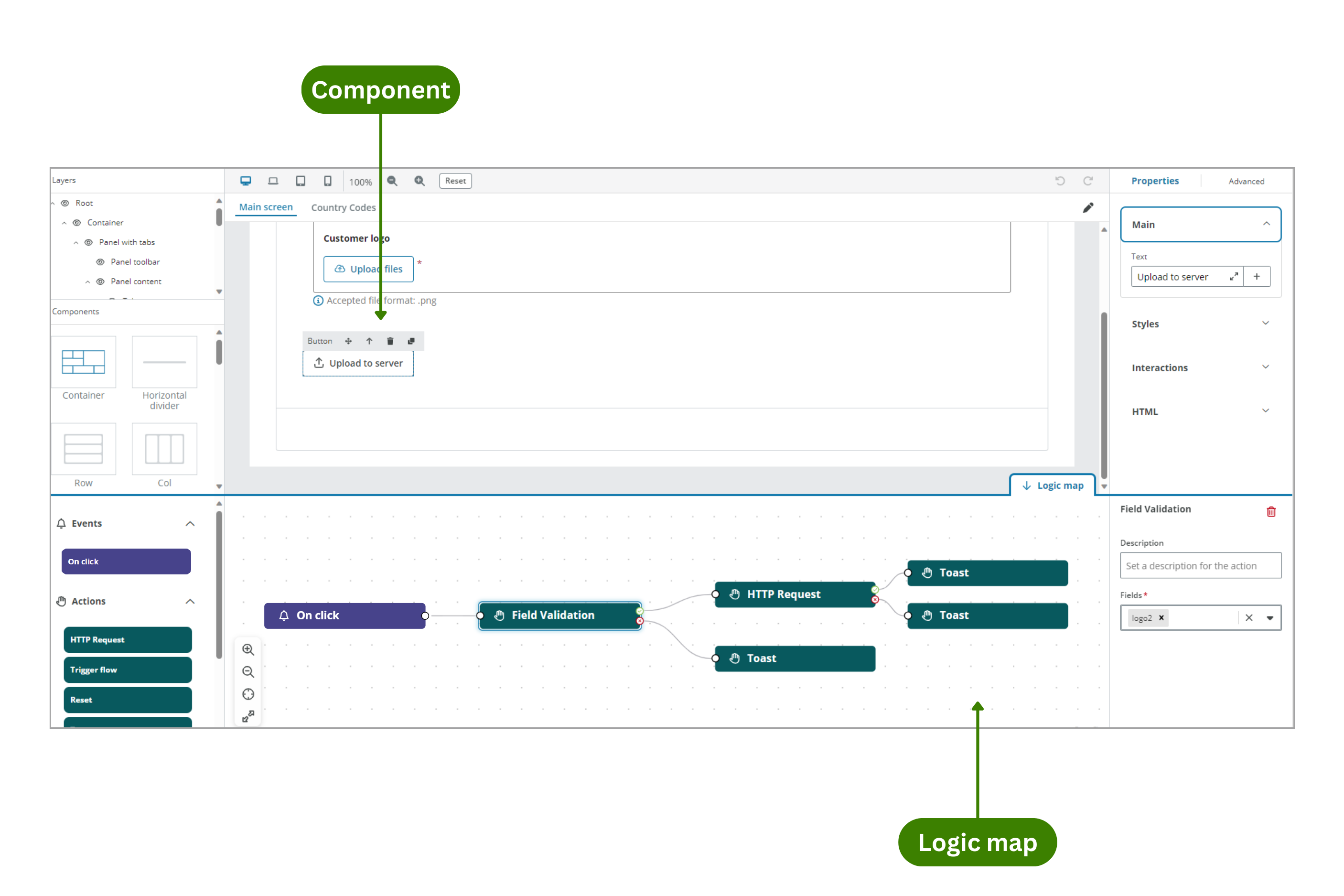
- The Logic map tab available in the bottom-right corner to configure component's logic.
Events
The following events are available:
| Event | Tab | Description | Actions | Components |
|---|---|---|---|---|
| On launch | Logic flow | Defines what happens when your app is launched. | Change screen, Field Validation, HTTP request, Modal, Reset, Toast, Trigger flow. | |
| On finish | Logic map | Defines what happens when the user selects the Finish button in the last step of the Wizard component. | HTTP request, Modal, Reset, Toast, Trigger Flow. | Wizard. |
| On click | Logic map | Defines what happens when the component is clicked. | Change screen, Field Validation, HTTP request, Modal, Reset, Toast, Trigger flow. | Button and Icon button. |
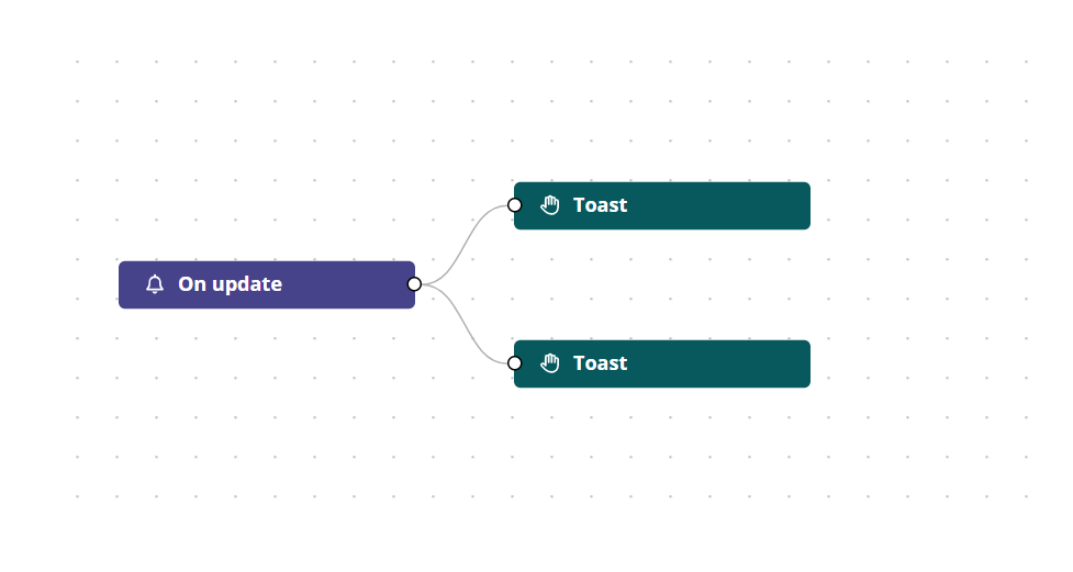
| On update | Logic map | Defines what happens when the user edits the component and tabs out of it. If the user does not change the value and/or does not tab out of it, the event does not trigger. | HTTP request, Trigger flow, Toast, Modal | Checkbox, File uploader, Radio button, Range slider, Select, Filter select, Switch, Text area and Text input. |
Actions
The following actions are available:
| Action | Tabs | Events | Components |
|---|---|---|---|
| HTTP Request | Logic flow and Logic map | On launch, On click, On update and On finish | Button, Checkbox, File uploader, Icon button, Radio button, Range slider, Select, Filter select, Switch, Text area, Text input and Wizard. |
| Trigger flow | Logic flow and Logic map | On launch, On click, On update and On finish | Button, Checkbox, File uploader, Icon button, Radio button, Range slider, Select, Filter select, Switch, Text area, Text input and Wizard. |
| Reset | Logic map | On launch, On click and On Finish | Button, Icon button and Wizard. |
| Field validation | Logic map | On launch and On click | Button and Icon button. |
| Toast | Logic flow and Logic map | On launch, On click, On update and On finish | Button, Checkbox, File uploader, Icon button, Radio button, Range slider, Select, Filter select, Switch, Text area, Text input and Wizard. |
| Modal | Logic flow and Logic map | On launch, On click, On update and On finish | Button, Checkbox, File uploader, Icon button, Radio button, Range slider, Select, Filter select, Switch, Text area, Text input and Wizard. |
| Change screen | Logic map | On launch and On click | Button and Icon button. |
HTTP Request
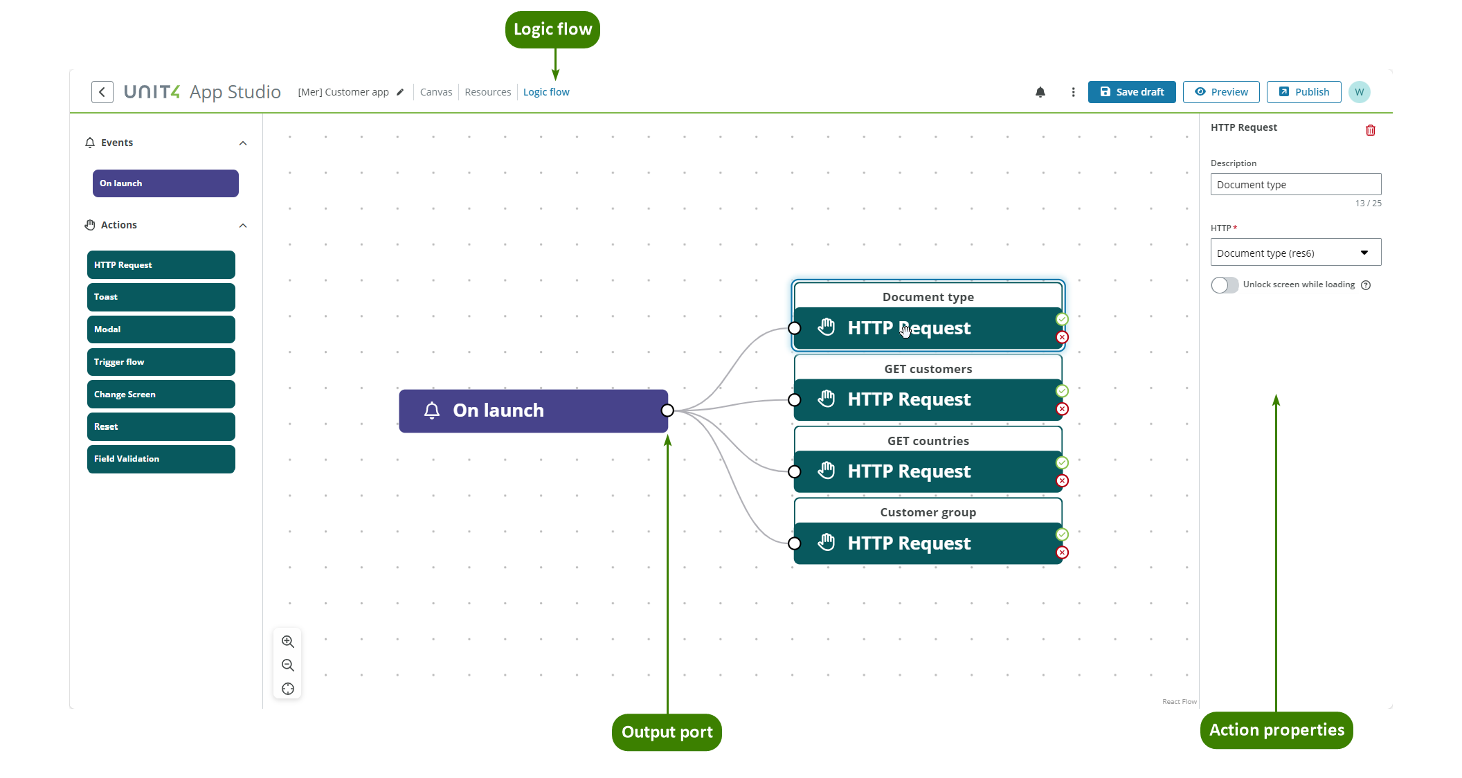
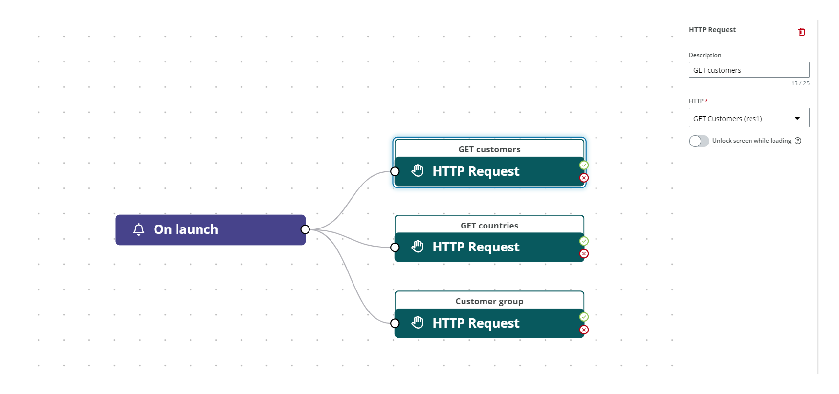
The HTTP Request action links a REST API operation (GET, POST, PUT, PATCH, DELETE) that is defined in the Resources section to the selected event.
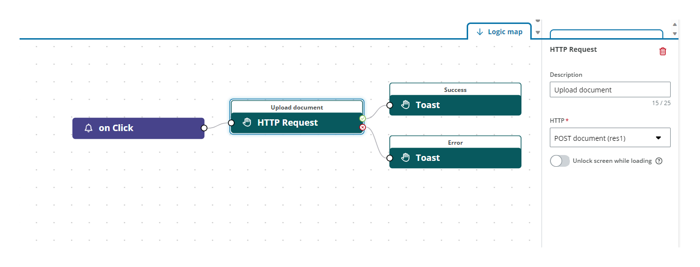
HTTP Request nodes have one input port and two output ports: Green check handle for success output and Red cross handle for error output.
The HTTP Request action has the following properties:
| Property | Description |
|---|---|
| Description | Enter an optional description of your action. |
| HTTP | Select one of all the available HTTP resources defined in the Resources section. |
| Unlock screen while loading | Turn on to allow the user to continue to use the app while the API calls are being made in the background. A spinner will appear to let the user know that something is happening in the background. By default, the loading spinner blocks the screen during data loading. |
In the example below, three HTTP Request actions are linked to the On launch event such that Customers, Countries and Customer group data are loaded when the end-user app is launched. Three resources are created in the Resources section with the necessary REST API operations defined.
In the example below an HTTP Request is linked to the On click event for a Button component, and when the button is selected, the HTTP request is triggered for a POST operation to upload a document. There is one resource created in the Resource section with the necessary REST API operations defined.
Note: GET requests linked to an event are triggered only when the event occurs.
Trigger flow
The Trigger flow action allows you to trigger an Extension Kit flow at a certain point in the app's logic. See Flow resource for more details.
The Trigger flow action has the following properties:
| Property | Description |
|---|---|
| Description | Enter an optional description of your action. |
| Flow | Select the configured flow to use. See Flow resource for more details. |
| Unlock screen while loading | Turn on to allow the user to continue to use the app while the flow is running in the background. A spinner will appear to let the user know that something is happening in the background. By default, the loading spinner blocks the screen during data loading. |
Reset
The Reset action is used to reset the status of the form to when it was loaded, meaning that it clears all the information the user has added but still displays the information that was set to be shown as default.
The Reset action has the following properties:
| Property | Description |
|---|---|
| Description | Enter an optional description of your action. |
Field validation
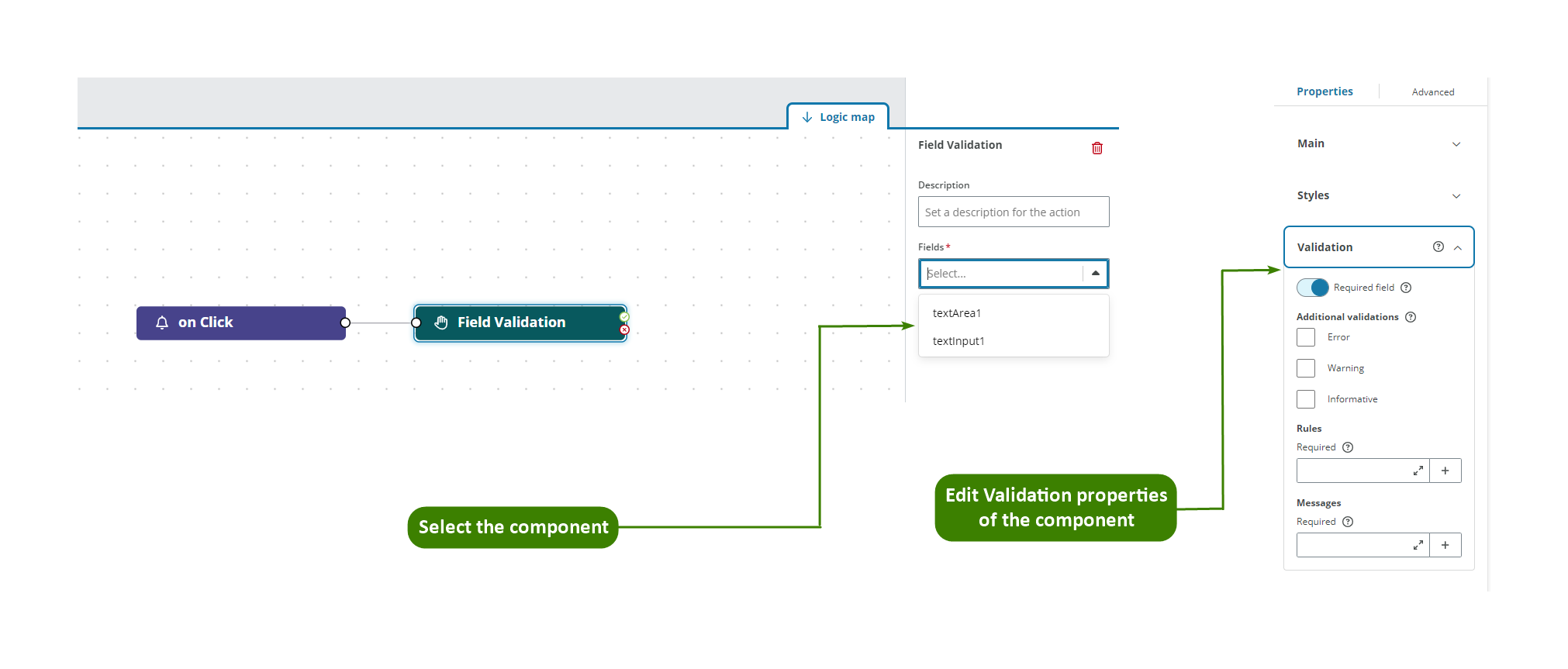
The Field validation action allows you to define when and where you want to perform a validation in the app's logic. The validation rules for the field are defined using the Validation properties of the component you have selected in the Fields dropdown. See Validation for more details.
Validation nodes have one input port and two output ports: Green check handle for success output and Red cross handle for error output.
The Field validation action has the following properties:
| Property | Description |
|---|---|
| Description | Enter an optional description of your action. |
| Fields | Select the Component ID from the dropdown list of the field where you want to perform the validation. |
Toast
The Toast action allows you to display information in a toast message. Toast messages are at the top-right corner of the window and are intended to be an unobtrusive way to display information to the user.
Only one toast message can be displayed at a time (see Rules for actions). Toasts must be manually dismissed unless a new toast is displayed in the window and then, the new one will replace the previous one.
Toast nodes have only one input port and no output port.
The Toast action has the following properties:
| Property | Description |
|---|---|
| Description | Enter an optional description of your action. |
| Type of toast | Select the kind of message you want to show. The types of messages are Success, Error, Information, Warning |
| Heading | Enter the text displayed in the toast. You can reference using Liquid. If the text of the Heading is too long, only the first three lines are shown in the toast and the text is truncated with an ellipsis (...). Hovering over the text shows the rest of the Heading. |
| Body | Enter the body of the toast. You can reference using Liquid. If the text of the Body is too long, only the first two of lines are shown in the toast and the text is truncate with an ellipsis (...). A Read more / Read less button appears to display and hide the complete text. |
Modal
The Modal action allows you to include information modals in the app's logic in cases that require a response from the user, such as a confirmation before the logic continues.
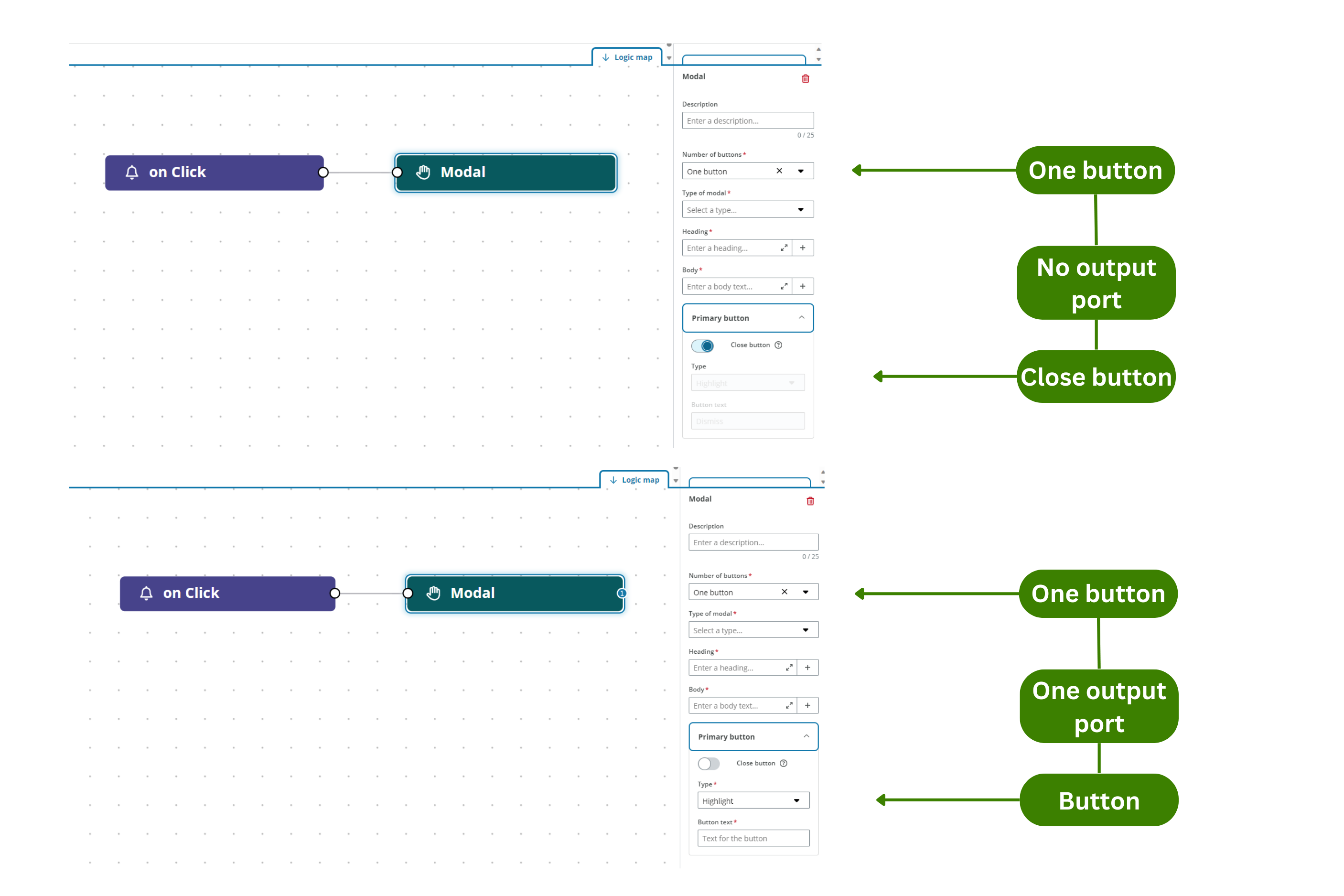
Modal nodes have only one input port and can have zero, one or two output ports depending on the number of buttons of the modal.
The Modal action has the following properties:
Modal
| Property | Description |
|---|---|
| Description | Enter an optional description of your action. |
| Number of buttons | Select the number of buttons from the dropdown. See How to configure the buttons section for more details. |
| Type of modal | Select the kind of message you want to show. The types of messages are Success, Error, Information, Warning. |
| Heading | Enter the text displayed in the modal. You can reference content using Liquid. |
| Body | Enter the body of the modal. You can reference content using Liquid. |
Primary button / Secondary button
| Property | Description |
|---|---|
| Close button | Turn on to set the button to close the modal window. |
| Type | Sets if the button is Highlight or Negative. This sets the button placement with the Highlight button placed to the left of the Negative button. |
| Button text | Mandatory text to be displayed in the button. |
How to configure the buttons for the Modal action:
- Modal with one button
To configure the modal window with one button:
- Choose One button from the Number of buttons dropdown.
- The Primary button menu becomes available. Open and configure:
- By default, the Close button switch is turned on, with the Highlight Type and 'Dismiss' in the Button text.
- Turn off the Close button switch to change the functionality of the button, the properties become editable and one output port appears to connect any actions you want the end-user to perform when selecting the button. A cross appears in the top-right corner of the modal to allow the user to close it.
- Modal with two buttons
To configure the modal window with two buttons:
- Choose Two button from the Number of buttons dropdown.
- The Primary button menu becomes available. By default, the Close button switch is disabled and all fields are editable.
- The Secondary button menu becomes available. Open and configure:
- By default, the Close button switch is turned on, the modal node presents one output port to connect an action for the Primary button and all fields are editable.
- Turn off the Close button switch to change the functionality of the button, two output ports appear to connect any actions you want the end-user to perform when selecting the button. A cross appears in the top-right corner of the modal to allow the user to close it.
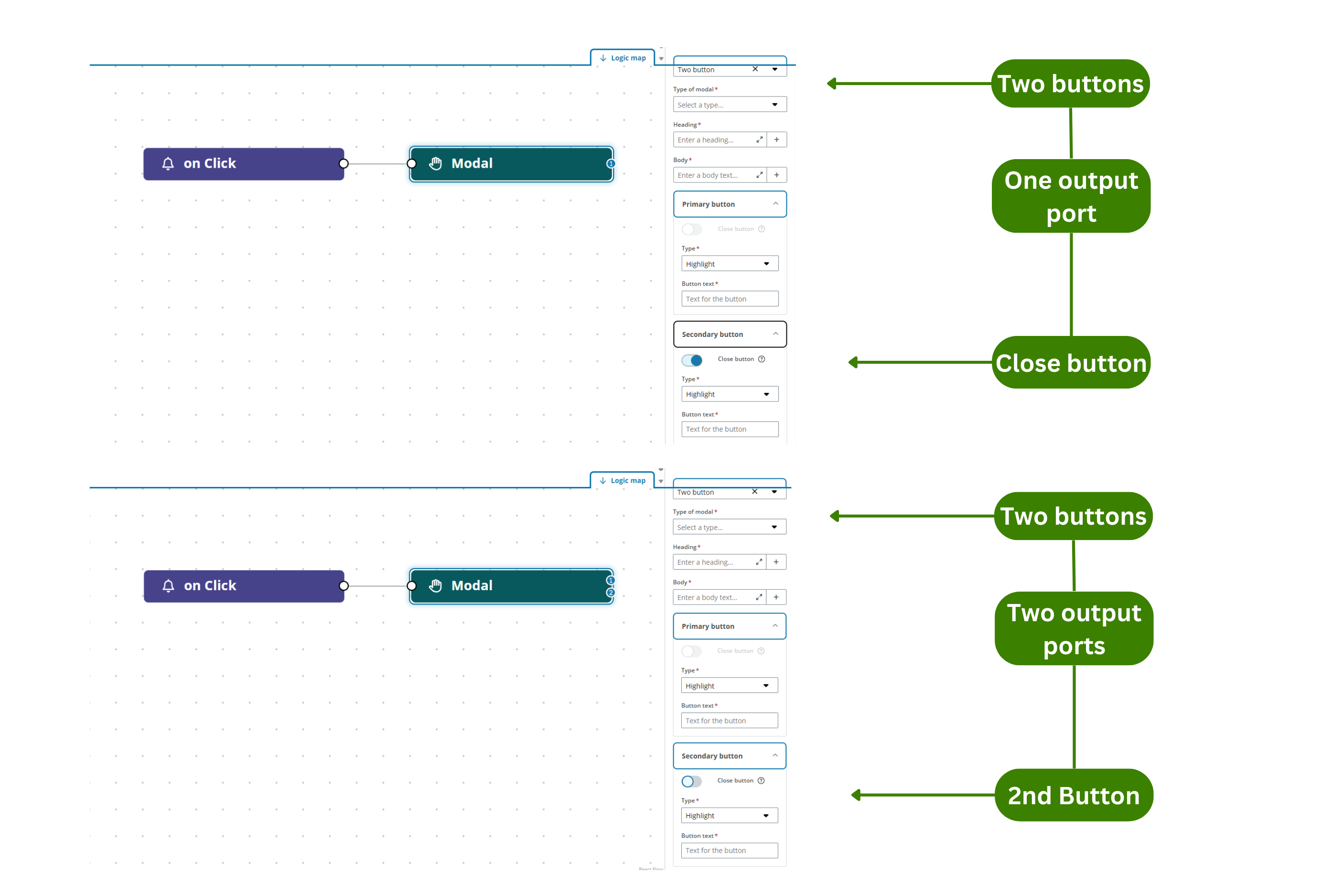
Note: When you change from one button and one output port to two buttons and two output ports, the existing link is kept as the Primary button. When you change from two to one, the primary link is kept and the secondary removed.
Change Screen
The Change Screen action allows you to define the navigation between screens in an app that has more than one screen.
The Change Screen action has the following properties:
| Property | Description |
|---|---|
| Description | Enter an optional description of your action. |
| Screen | Select the screen that the component opens. |
| Transition animation | Select the type of transition between screens from the dropdown. The animations types are: from the left, right, top or bottom. |
Rules for actions
The following rules apply to actions:
- Concatenation of actions is allowed.
- Linking an output port to an input port of the same action node is not allowed.
- Infinite loops with a connection between the last action of a flow and the first one of the same flow is not allowed.
- When you set HTTP Request actions in parallel, all requests are launched simultaneously.
- If you set Modal or Toast actions in parallel, the last one added is shown regardless of how the actions are placed above or below each other in the viewport.