Table
The Table component is used to present your data in table format. It supports:
- Viewing and filtering presented data.
- Editing data.
- Adding and deleting rows.
- Importing and exporting data.
Example
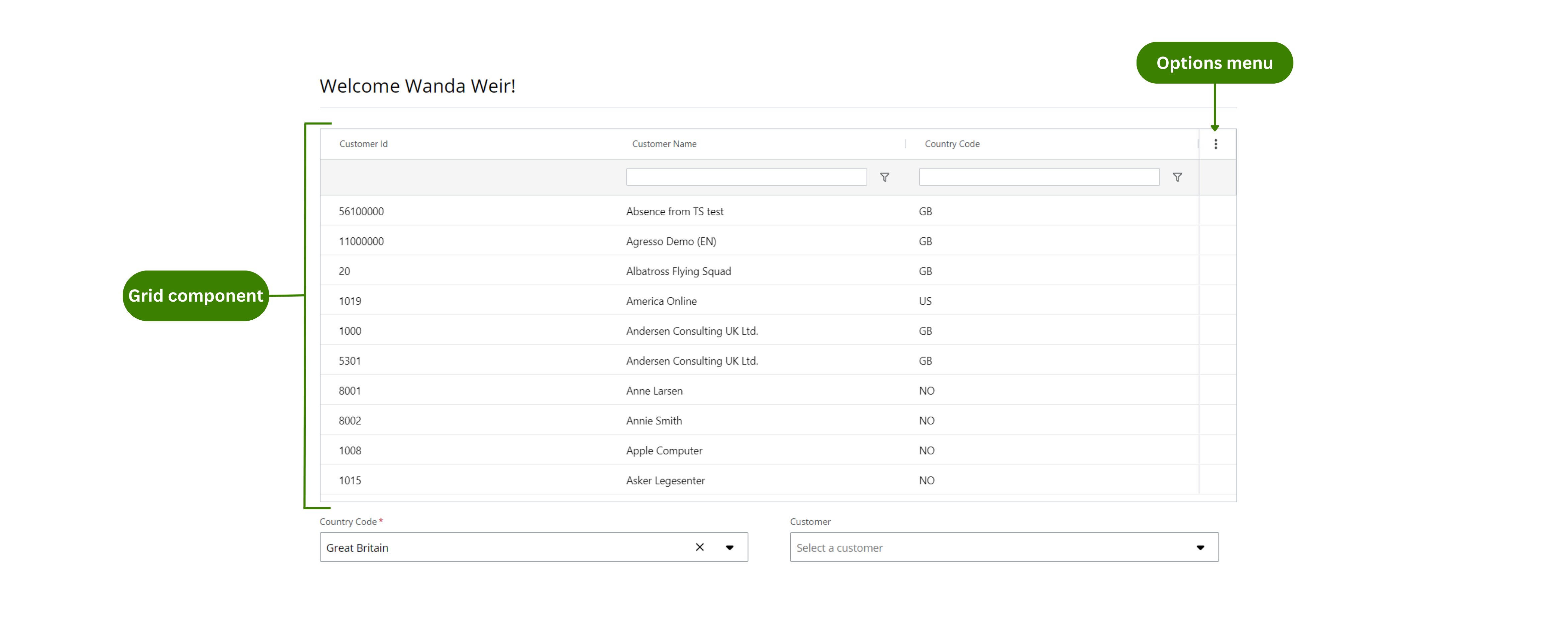
You can use the Table component to create an app that shows a list of your customers. In this example: + Users can edit the Country code column. + Users can add rows. + Users can import or export the data in Excel.
Note: The Table component follows the WCAG 2.0 AA accessibility guidelines.
Configuration example
This example shows how to configure the List of customers app (see Example of usage) Follow these steps to configure it:
-
Drag the Table component to a previously added Layout component in the canvas.
-
Select the Table component in the canvas and go to the Properties panel.
-
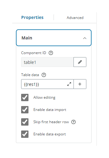
Open the Main menu and configure:
- Component ID: Enter a meaningful name and select the Save button.
- Table data: Enter an array or import data from your resources using Liquid. For example
{{res1}}. The Liquid reference must be an array.
Note: You must edit all your resources in the Resource tab. For more information see Resources and also read the Properties section below.
- Select the checkboxes of the properties you want to enable in your table. This example allows editing so the Country code column can be edited. We also want to enable data import and export, and skip the first header row.
-
Open the Styles menu and configure:
- Table height: Choose the size of your table. The data that does not fit, is accessible by scrolling.
- Select Show filter row checkbox to display the filter functionality.
-
Open the Columns menu. Three columns are available by default. Open each Column's menu and configure:
- Column ID: Enter a meaningful name and select the Save button.
-
Column data: Choose the field that you want the column to display from the previously imported array in Table data. You can:
- Enter it using Liquid. For example
{{customerId}} - Select the Plus (+) button and choose from the available fields. Only arrays are available. In this example we call the Customer Id field in the first column, the Customer name in the second column and the Country code in the third column.
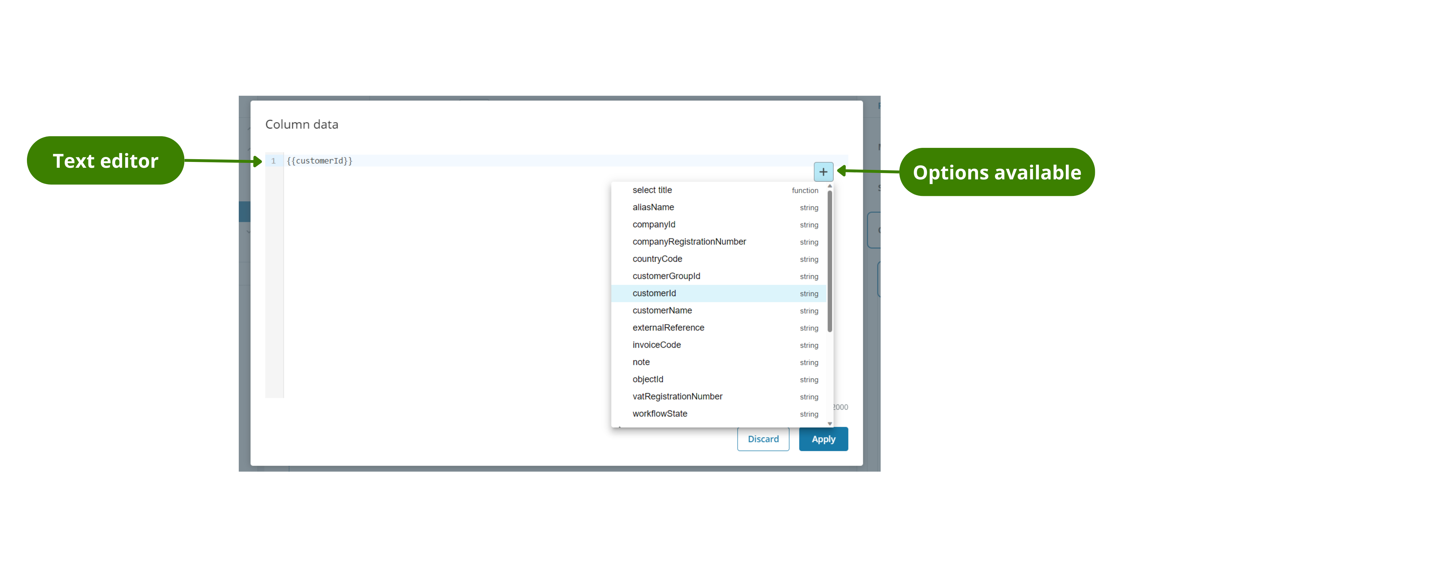
- Enter it using Liquid. For example
-
Width: Select stretch in each column to have the columns occupy all the space, as in this example.
- Datatype: Select the type of data for each column. Select text from the drop-down in all the columns if the data displayed is going to be text as in this example.
- Select the checkboxes of the properties you want to enable in your table. In this example we select Read only with no rules for the first and second column and nothing in the third column so it can be edited.
Note: Only the properties relevant to the example are explained.
Properties
The following Table component properties are available:
Main
| Property | Description |
|---|---|
| Component ID | Enter a unique name for the component. See templating in components for more details. |
| Table data | Enter an array with the table data (you can use templating) or enter the resource that returns the data for the table. You can select the Plus (+) button to display a drop-down with the available arrays or enter the text using Liquid. For example {{res1}}Note: You must edit the Resource in the Resources tab. |
| Allow editing | Select the checkbox to make the table editable. If selected, the end-user app presents: A Three dots menu with the options Add row and Reset table Changes.A trash-can icon next to rows to allow them to be deleted.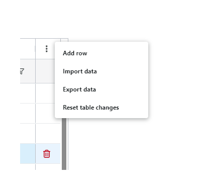 |
| Enable data import | Select the checkbox to enable data to be imported into the table from an Excel file. If selected, the Import Data option is added to the end-user app's Three dots menu and an Import rows icon is displayed in the table. 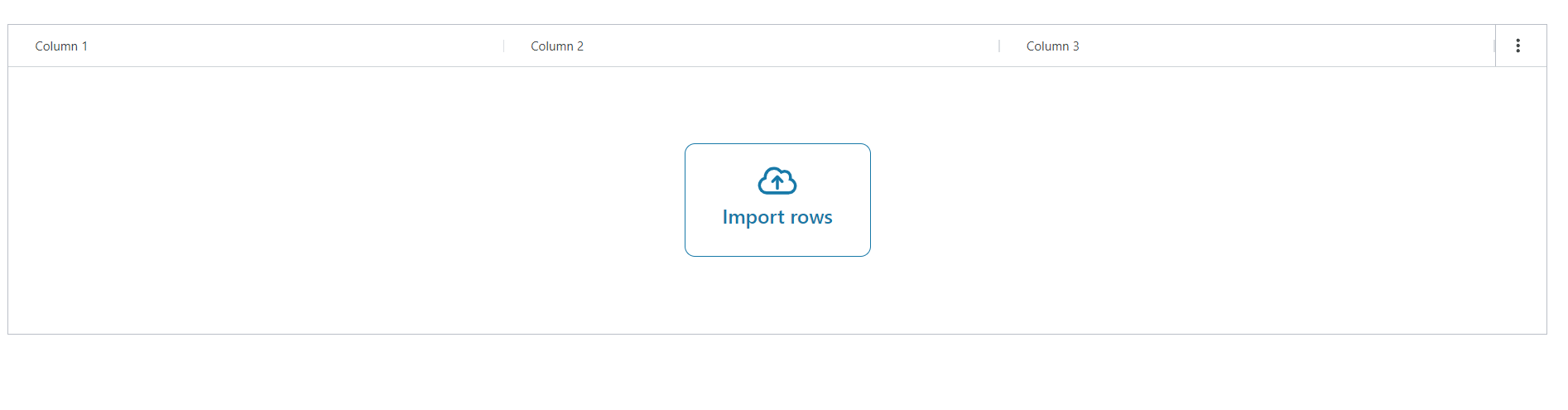 |
| Skip first header row | Select the checkbox and when importing data, the first row of the Excel file is treated as the header and not imported. |
| Enable data export | Select the checkbox to enable data to be exported from the table as an Excel file. If selected, the Export Data option is added to the end-user app's Three dots menu. |
Styles
| Property | Description |
|---|---|
| Table height | Select the height of the table. |
| Show filter row | Select the checkbox to activate the filter functionality. A filter row is displayed to allow filtering on the various columns. 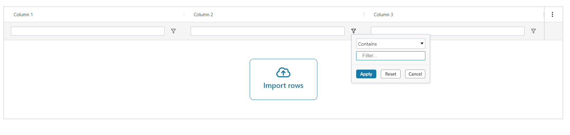 |
Column
| Property | Description |
|---|---|
| Column ID | Enter a unique name for the column. This unique identifier is used to reference the component in Liquid. See use data from the Table component Liquid arrays start at 0. |
| Title | Enter the column title. |
| Column data | Choose the Table data field that you want to display data from. You can choose an option from the Plus (+) button or write the text using Liquid in the text editor. For example {{name}} |
| Default value | Enter the value that is displayed in this column when you add a new row. You can either create it from other columns in the table (using Liquid syntax) or enter a fixed value. |
| Width | Choose the width of the column. |
| Datatype | Choose what kind of data that is displayed in the column. |
| Decimals | Only available when Number datatype is selected. Enter how many decimals are allowed. |
| Options | Only available when Value list datatype is selected. Enter the resource to return the data for the select, these will be the drop-down options. You can choose the array from the drop-down displayed when selecting the Plus (+) button (only arrays will be available) or type it in using Liquid. For example {{res2.countries}}. |
| Value field | Only available when Value list datatype is selected. This is the real data associated with the options. Import a value using Liquid from the previously imported array in Options, for example, {{code}}. |
| Display field | Only available when Value list datatype is selected. This is what is visible to the user. Import a value using Liquid from the previously imported array in Options, for example, {{code}}. |
| Hidden | Select the checkbox to hide the column. You can set rules to hide the column using Liquid. See add rules to trigger properties for more details. |
| Read only | Select the checkbox to set the column to read only. You can set rules to allow editing using Liquid. The checkbox is only available when Allow editing checkbox is selected in the Main menu. See add rules to trigger properties for more details. |
| Disable filter | Select the checkbox to disable filtering in this column. |
| Disable move | Select the checkbox to lock the column in place. |
| Disable resize | Select the checkbox to set a fixed width for the column and disable resizing. |
| Disable sort | Select the checkbox to prevent sorting within this column. |
Interactions
| Property | Description |
|---|---|
| Hidden | Select the checkbox to hide the component in the end-user app. You can set rules to hide the component using Liquid. The rules are only available when hiding the component with the checkbox not when hiding the component from the canvas with the Eye icon in the Layers panel. |
Note: See add rules to trigger properties for more details on setting rules to these properties.