Select
The Select component is used to create a drop-down list.
It allows mouse and keyboard navigation using arrow or letter keys, in both expanded and collapsed states. Keyboard navigation uses the Display field data, not the Value field data. See Main properties.
Example
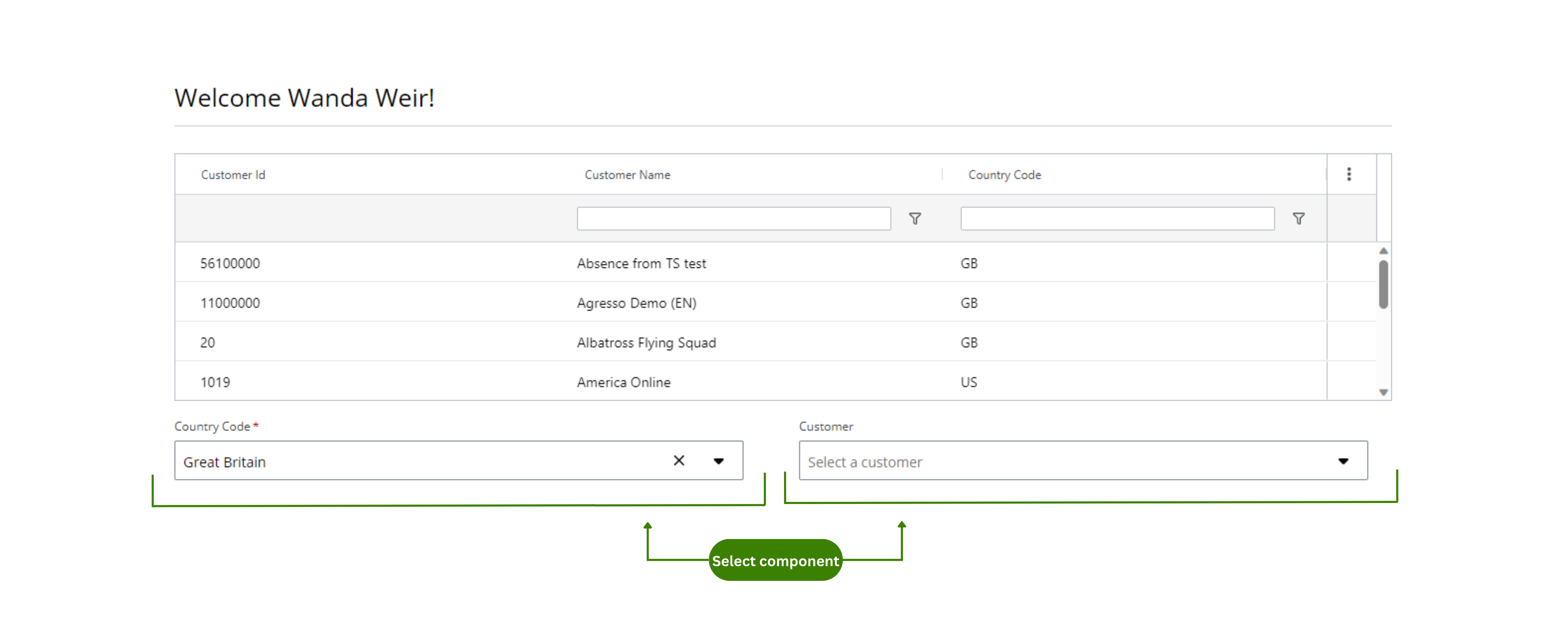
You can use the Select component to create a required drop-down that filters the content of another drop-down. In this example:
- Users must select a country in the Country code drop-down.
- Users will find a filtered list of the options available for that country in the Customers drop-down.
Note: The Select component follows the WCAG 2.0 AA accessibility guidelines.
Configuration example
This example shows how to configure the Country code and Customer drop-downs (see Example of usage). Follow these steps to configure them:
-
Country code drop-down:
-
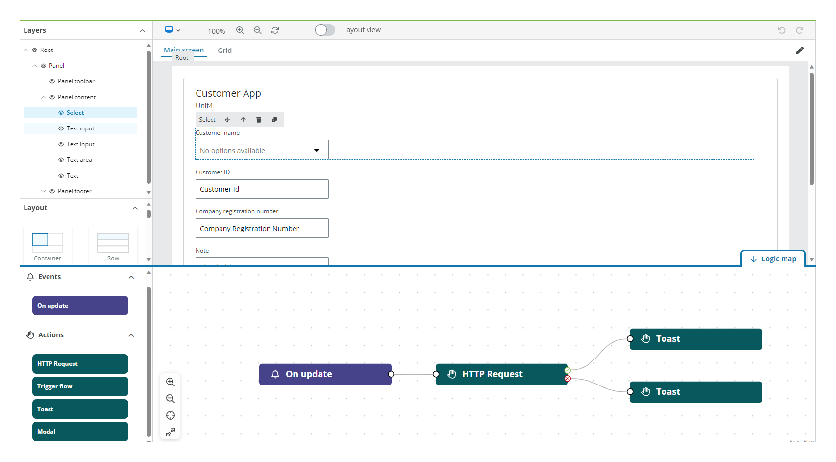
Drag the Select component to a previously added Layout component in the canvas.
-
Select the Select component in the canvas and go to the Properties panel.
-
Open the Main menu and configure:
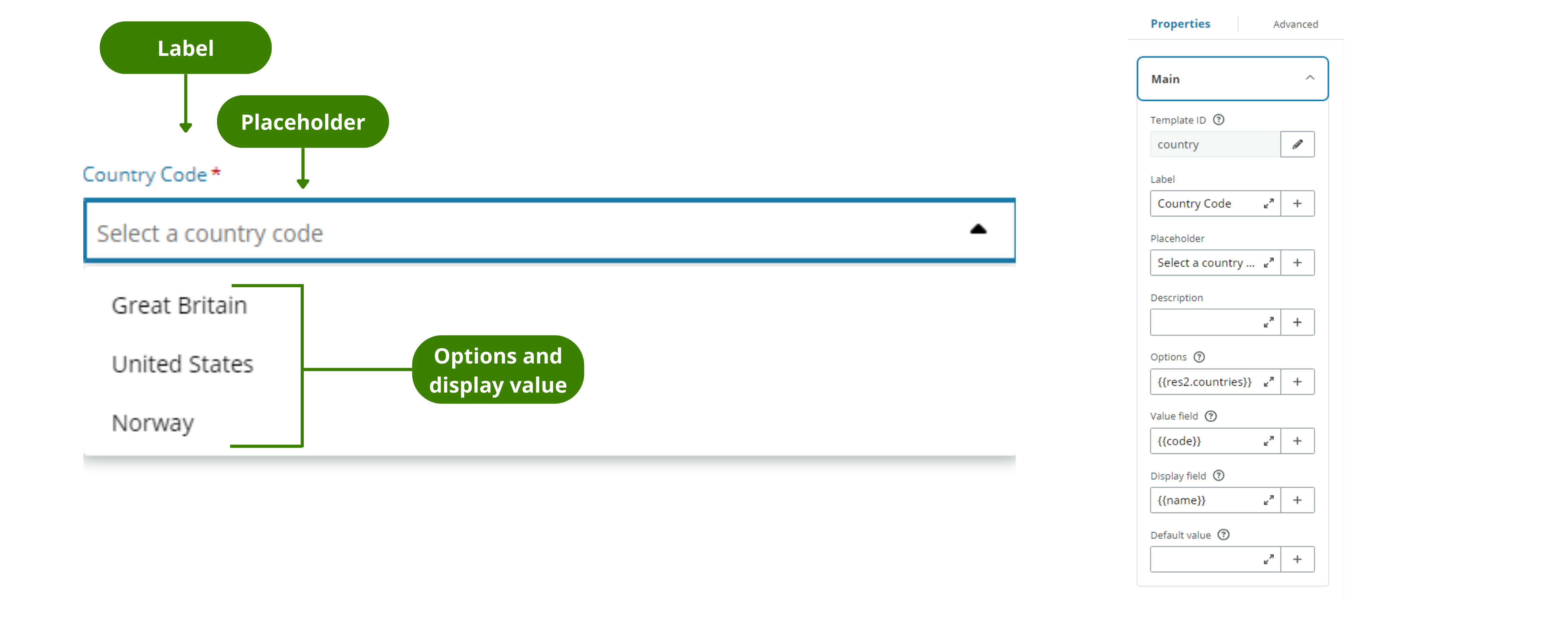
- Template ID: Enter a meaningful name and select the Save button.
- Label: Enter the text that you want to appear above your drop-down. For this example, Country code for the first select and Customers in the second.
- Placeholder: Enter the text that you want to appear in the field before selection. For this example, Select a country code in the Country drop-down and Select a customer in the Customer drop-down.
- Options: Import your data from resources using Liquid. In this example
{{res2.countries}}. The Liquid reference must be an array.
Note: You must edit all your resources in the resource tab. For more information see resources and also read the Properties section.
- Value field: Import your data from resources using Liquid or select the Plus (+) button to display the drop-down with the resource options available. In this example
{{code}}, since we want the code of the country to be considered when filtering in the second select, but not displayed . The Liquid reference must be an array. - Display field: Import your data from resources using Liquid or select the Plus (+) button to display the drop-down with the resource options available. In this example
{{name}}, since we want the name of the country that corresponds to each country value to be displayed in the drop-down for the user to select. The Liquid reference must be an array. - Default value: You can choose a value to be displayed by default instead of the placeholder. For this example, the Value field is "GB" that will display the Display field "Great Britain" by default.
-
Open the Styles menu. See Styles.
-
Open the Validation menu and configure:
- Required field: Toggle to make the Select component mandatory. You can use Liquid to add a rule to make it required. See add rules to trigger properties for more information. In this example the Country code drop-down is required and the Customers drop-down is not.
-
Open the Interactions menu. See Interactions
-
The HTML menu is empty for this example.
-
-
Customer drop-down:
-
Drag another Select component to the canvas and follow the same instructions to configure the Country code drop-down, except:
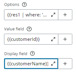
- Options: Import your data from resources using Liquid to filter customers by country code like this
{{res1 | where: 'countryCode', country.value}}, wherecountrycorresponds to the Template ID from the Country drop-down. Go to add a filter to a component for more information.
Note: When you filter the array the Plus (+) button options will no longer be available, you must write in Liquid the Value field and the Display field.
- Options: Import your data from resources using Liquid to filter customers by country code like this
-
Note: Only the relevant properties to the example are explained.
Properties
The following Select component properties are available:
Main
| Property | Description |
|---|---|
| Template ID | Enter a unique name for the Select component. |
| Label | Enter the name you want to be displayed above the Select component. |
| Placeholder | Enter the text you want to display in the field before any option is selected. By default, "No options available" text is displayed. |
| Description | Add a description for the component. This is displayed under the component. Error messages have priority and will hide the description temporarily. |
| Options | Enter the resource to return the data for the select, these will be the drop-down options. You can choose the array from the drop-down displayed when selecting the Plus (+) button (only arrays will be available) or type it in using Liquid. For example {{res2.countries}}Note: You must edit the Resource in the Resources tab |
| Value field | This is the real data associated with the options. Import a value using Liquid from the previously imported array in Options, for example, {{code}}. |
| Display field | This is what is visible to the user. Import a value using Liquid from the previously imported array in Options. For example {{country}}. |
| Default value | Enter a value from the Value field if you want this value to appear by default instead of the Placeholder text. |
Styles
| Property | Description |
|---|---|
| Input height | Select the height of the select. |
| Input width | Select the width of the select. |
| Inline label | Select the checkbox to position the Label inline. |
| Clearable | Select the checkbox to allow users to clear the selection. |
| Show full description | Select the checkbox to show the full text of the Description from the Main properties. |
Validation
| Property | Description |
|---|---|
| Required field | Turn on to make the component mandatory. By default, the component is optional. |
| Add rule | Add rules in Liquid to specify when the component is required. If no rules are set, the component will be required in all instances. See add rules to trigger properties for more details. |
| Message | Enter a message to be displayed if the user does not fill in the input. A default message is otherwise shown. |
Interactions
| Property | Description |
|---|---|
| Hidden | Select the checkbox to hide the component in the end-user app. You can set rules to hide the component using Liquid. The rules will be available only when hiding the component with the checkbox not when hiding the component from the canvas with the eye icon in the Layers panel. |
| Disabled | Select the checkbox to disable the component in the end-user app. You can set rules to disable the component using Liquid. |
| Read only | Select the checkbox to set the component to read only. You can set rules to prevent editing using Liquid. |
Note: See add rules to trigger properties for more information on setting rules to these properties.
HTML
| Property | Description |
|---|---|
| Title | Enter a text to display as a tooltip when hovering the mouse over the component in the end-user app. |
| Tab index | Enter the navigation order for keyboard navigation. |
Events
The Select component supports the On update event. See events and actions for more details.