Panel with Tabs
Usage
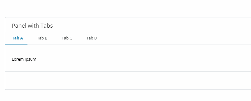
A Panel with tabs component consists of tabs and tab panels that are available at all times, but only one is shown at once. Tabs function similarly to buttons. When one tab is activated, the corresponding panel is made visible.
Behaviour
When the component is active the user should be able to enter, edit or see data for the selected (active) tab. Other tabs are available at all times but not displayed. Once a new tab is selected a new panel will appear.
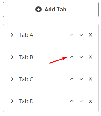
It is also possible to rearrange Tabs using the up (↑) and down (↓) arrows, available in the "Properties" panel.
Properties
Title(String) - the visible title for the entire componentSubtitle(String) - the visible subtitle for the entire componentPanel Height(String) - defines the height of the component. It is possible to choose from:- Allowed values: {
fit,xs,s,m,l,xl,xxl} - Default:
fit Hide footer(Boolean) - if checked (set to true) hides the footer of the componentHide border(Boolean) - if checked (set to true) hides the border of the componentAdd Tab(Button) - Pressing the button adds a new tab to the component
Tabs
Tab Title(String) - the visible title for the specific tabTab Disabled(Boolean) - if checked (set to true) disables the specific tab, making it visible (greyed out) and not clickable
Do's and Don'ts
For more details, refer to Panel with Tabs Usage and Visual styleguides in our Storybook.