Text Input
The Text input component is an input field that allows users to enter information inside. You can:
- Navigate using mouse and keyboard with arrow and letter keys.
- Enter text using either a physical or a virtual keyboard. When using the virtual keyboard, the input selector allows you to enter letters and numbers.
Example
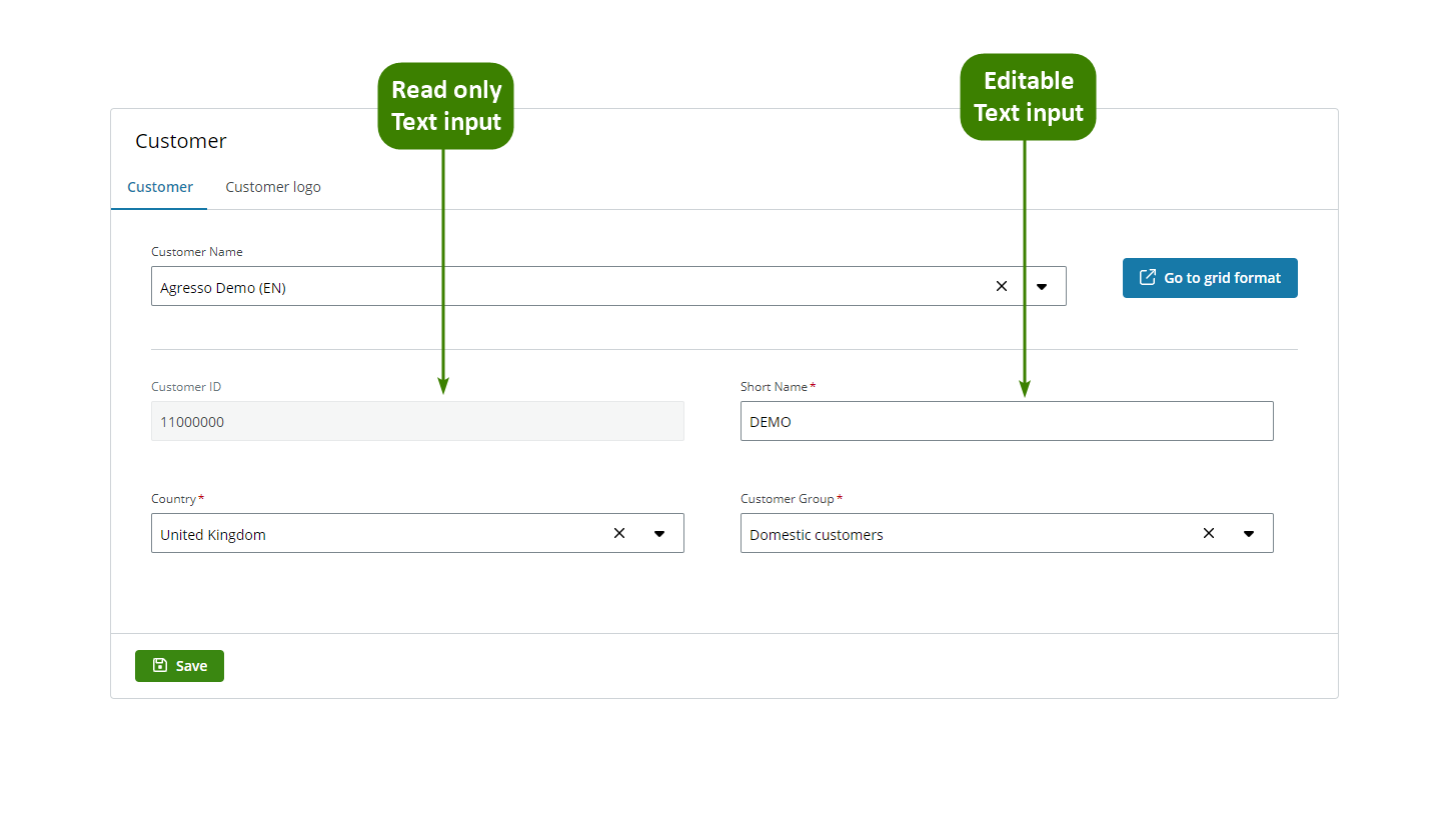
You can use the Text input component to create an app to modify your customer information. In this example:
- Users can view the Customer ID in the Text input component.
- Users can edit the Short name in the Text input component.
Note: The Text input component follows the WCAG 2.0 AA accessibility guidelines. See the Properties section for accessibility configuration tips.
Configuration example
This example shows how to configure the Customers app (see Example of usage). Follow these steps to configure it:
- Drag the Text input component to a previously added Layout component in the canvas.
-
Select the Text input component in the canvas and go to the Properties panel.
-
Open the Main menu and configure:
-
Component ID: Enter a meaningful name and select the Save button. See templating in components for more details.
-
Label: Enter the text you want to appear above your text field. This example shows Customers ID above the first text input and Short name above the second. See the Properties section for accessibility information.
- Placeholder: Enter a text that provides a hint for the expected input. This example shows Customer ID in the first text input and Short name in the second. Read the Properties section for accessibility information.
-
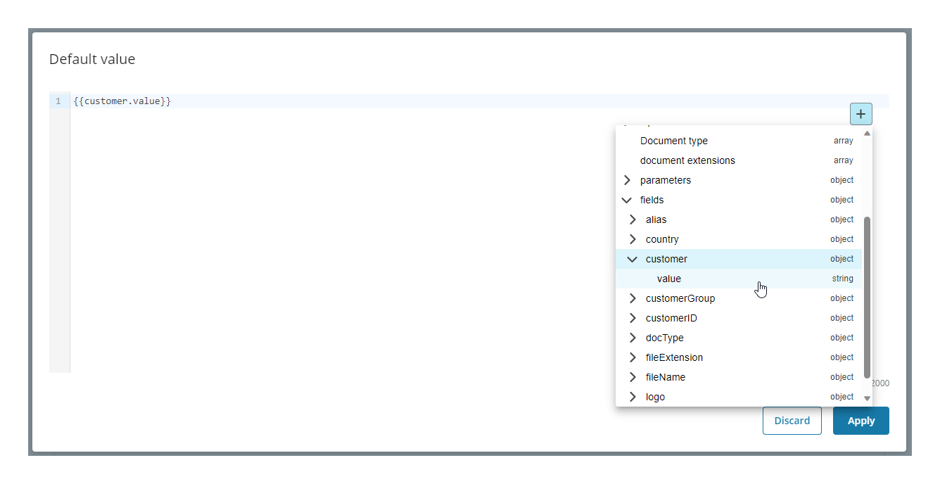
Default value: You can choose a value to be displayed by default. For this example:
-
Customer ID text input: To pre-fill the text input with the selection made by the user in the Customer Name selector of the app, follow these steps:
- Select the Plus (+) button.
- Go to Fields and open the menu.
- Select the data you want to display. In this example, we select value, which refers to the input of the Customer name selector where we have used
{{customerId}}. As a result, the corresponding customer ID is displayed in the Text input component. See Templating drop-down for more details.
- Short name text input: To pre-fill the text input with the short name of the customer selected by the user, you need to create another resource to make a call to the necessary API. After creating the resource, retrieve the data using Liquid. You have two options: select the data from the drop-down displayed by selecting the Plus (+) button or enter the data manually, for this example
{{res2.aliasName}}.
-
Note: You must edit all your resources in the Resource tab. See resources for more details.
-
-
Open the Validation menu and configure:
- Customer ID text input: Keep the default settings.
- Short name text input: To make the field mandatory, you must turn on the Required field switch and leave all the other options in their default settings.
-
Open the Interactions menu and configure:
- Customer ID text input: Select the Read only checkbox. We want the field to always be read only so we do not add any rules.
- Short name text input: Select the Read only checkbox and add a rule so it is set to read only until a customer is selected in the Customer name selector. Enter the rule in Liquid, for this example
{{customer.value == ""}}, wherecustomercorresponds to the Component ID of the Customer name selector. This rule reads: if the customer value is an empty string, set the component to read only. See add rules to trigger properties for more details.
Note: Only the properties relevant to the example are explained. See the Properties section for more details.
Properties
The following Text input component properties are available:
Main
| Property | Description |
|---|---|
| Component ID | Enter a unique name for the component. See templating in components for more details. |
| Label | Enter the name you want to be displayed above the component. To make the component accessible to assistive technology, make sure to be as descriptive as possible. For example, if the expected input is an email, enter a descriptive label such as 'Enter your email'. |
| Placeholder | Enter a text that provides a hint for the expected input. By default, 'Placeholder' text is displayed. To make the component accessible to assistive technology, make sure to be as descriptive as possible. For example, if the expected input is an email, enter a descriptive placeholder such as 'example@email.com'. |
| Description | Add a description for the component. The text is displayed under the component. Error messages have priority and will hide the description temporarily. |
| Default value | Enter a value to appear by default. |
Note: See Templating drop-down for more details on rendering dynamic content using Liquid.
Styles
| Property | Description |
|---|---|
| Input format | Select the format from the drop-down. |
| Input height | Select the height. |
| Input width | Select the width. |
| Max length | Enter the maximum number of characters allowed. |
| Inline label | Select the checkbox to position the Label inline. |
| Show count | Select the checkbox to display a word counter under the text input. |
| Clearable | Select the checkbox to allow users to clear the field. |
| Show full description | Select the checkbox to show the full text of the Description from Main properties. |
Validation
| Property | Description | |
|---|---|---|
| Required field | Turn on to make the component mandatory. By default, the component is optional. | |
| Add rule | Add rules in Liquid to specify when the component is required. If no rules are set, the component will be required in all instances. | |
| Message | Enter a message to be displayed if the user does not fill in the input. A default message is otherwise shown. | |
| Choose common pattern | Select the expected input data from the drop-down. See available common patterns for more details. | |
| Additional validations | Select any or all checkboxes to add validations. | |
| Error | Select the checkbox to add a red error style validation to the component. | |
| Add rule | Add rules in Liquid to specify when the error validation is shown. This field is mandatory if you select the checkbox. | |
| Error message | Enter a message to be displayed if the user fills in the input incorrectly. This field is mandatory if you select the checkbox. | |
| Warning | Select the checkbox to add an orange warning style validation to the component. | |
| Add rule | Add rules in Liquid to specify when the warning validation is shown. This field is mandatory if you select the checkbox. | |
| Warning message | Enter a message to give the user advice on how to better fill in the input. This field is mandatory if you select the checkbox. | |
| Informative | Select the checkbox to add a blue informative style validation to the component. | |
| Add rule | Add rules in Liquid to specify when the informative validation is shown. This field is mandatory if you select the checkbox. | |
| Informative message | Enter a message to give the user any additional information. This field is mandatory if you select the checkbox. |
Note: See add rules to trigger properties for more details.
Interactions
| Property | Description |
|---|---|
| Hidden | Select the checkbox to hide the component in the end-user app. You can set rules to hide the component using Liquid. The rules are available only when hiding the component with the checkbox not when hiding the component from the canvas with the Eye icon in the Layers panel. |
| Disabled | Select the checkbox to disable the component in the end-user app. You can set rules to disable the component using Liquid. |
| Read only | Select the checkbox to set the component to read only. You can set rules to prevent editing using Liquid. |
Note: See add rules to trigger properties for more details on setting rules to these properties.
HTML
| Property | Description |
|---|---|
| Aria label | Enter a text designed to help assistive technology attach a label to the component. |
| Name | Enter a text to specify a name for the HTML element. |
| Title | Enter a text to be displayed as a tooltip when hovering the mouse over the component in the end-user app. |
| Tab index | Enter the navigation order for keyboard navigation. |
Events
The Text input component supports the On update event. See events and actions for more details.