Working with components
The drag-and-drop elements of App Studio are arranged in two panels:
-
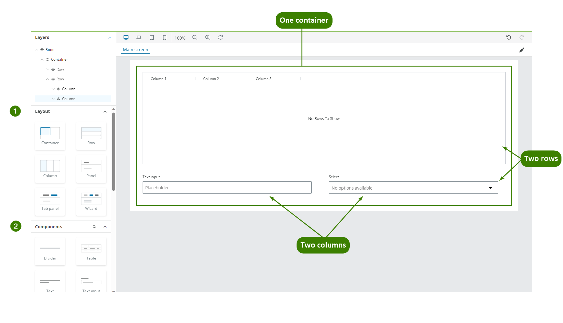
Layout panel: This panel groups all the elements that help you design the layout of your app. It is recommended to use these elements to contain all the functional components. First, drag a Container component to the Canvas viewport, then drag rows inside the Container and columns inside the rows. This practice will allow you to align all your app elements effectively.
-
Components panel: This panel groups all the elements with functionality. The Magnifying-glass icon button allows you to search components by name. Read each component's documentation for configuration details and tips.
Note: The Layers panel allows you to see and rearrange the component's hierarchy.
Component toolbar
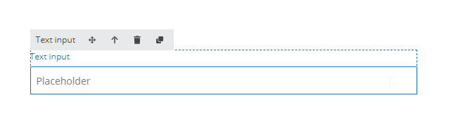
When you select a component in the Canvas viewport, a component toolbar is available with the following options:
- Drag: Select and move an element while holding it.
- Select parent component: Select the component that contains this component.
- Delete: Delete the selected component.
- Clone: Copy the selected component and its configuration.
Note: The Component toolbar displays an Eye icon when an Interaction property is set to Disabled or Read only and an Eye slash icon for Hidden.
Templating in components
The templating term refers to using Liquid template language to render dynamic content in the end-user app.
The Component ID of the component allows you to use the data from that component using Liquid. You can enter Liquid formulas in the fields or use the Plus (+) button to display the Liquid template drop-down. See Templating drop-down for more details.
The Component ID is automatically generated every time you add a component following the pattern:
[componentName][counter].
The counter is incremented for each new component added, for example, [TextInput4],[Select2].
Note: Component ID is not case sensitive.
A component's input is accessible using ".value", for example using the Liquid formula {textInput12.value}or selecting it from the Liquid template dropdown.
If the Component ID is changed in the Component ID field in the Main properties section then, all the references are automatically updated in all places where templating is allowed.
The following fields used in the components below do not get automatically updated since they depend on the resource selected in the Options field and not on the Component ID:
- Select/Filter select component: Display field, Value field.
- Radio group component: Display field, Value field.
It is recommended to enter a meaningful name in the Component ID and you cannot use an already existing name.
Note: The Container, Row, Column, Panel, Tab panel, Image, Icon, Link, Text and Divider components do not have Component ID.