Range slider
Usage
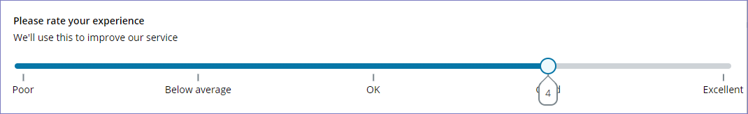
The Range slider component allows App users to provide ratings based on a configured range.
Behaviour
When the Range slider component is added to your App, the user is able to provide a rating by clicking on the selector and sliding it to the left and right to set the value.
Properties
The following Range slider properties are available:
Main
| Property | Description |
|---|---|
| Template ID | The unique ID of the component. |
| Label | The label that gets displayed as the range slider header. |
| Description | A description that gets displayed above the range slider. |
| Min. range value | Sets the minimum range value. |
| Max. range value | Sets the maximum range value. |
| Step size | Sets the gap between the steps in your configured range. |
| Default value | Sets which value the range selector appears on as default. This must be one of the allowed steps based on the selected max, min and size. |
Styles
| Property | Description |
|---|---|
| Show tooltip | Sets if a tooltip is shown for each mark in the defined range showing the selected value. The tooltip shows the numerical value of the selected point. |
| Show marks | Shows a mark for each point in the defined range. |
| Step indicator | Is available when Show marks is enabled and sets the style of the step indicator to be ticks only, numbers or custom. Custom lets you define a custom label for each marker in your range. |
Marks
This section is available when Step indicator is set to Custom. Here you can add and delete marks as required, and for each mark you must define:
| Property | Description |
|---|---|
| Label | The custom label to be shown for the mark. |
| Value | The step position of the mark and its label (must be an integer). |
Interactions
| Property | Description |
|---|---|
| Hidden | Sets if the component is hidden under certain conditions as defined in Hidden rule. |
| Disabled | Sets if the component appears disabled under certain conditions as defined in Disabled rule. |
| Read only | Sets if the component appears as read only under certain conditions as defined in Read only rule. |