File uploader
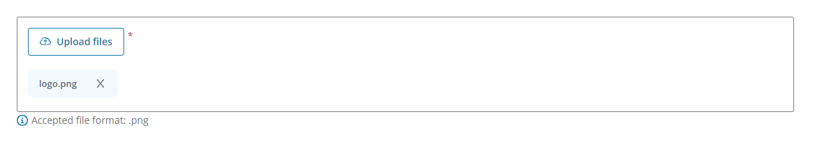
The File uploader component allows the users of your app to upload files as attachments.
The user can:
-
Attach one or more files to the app either by selecting the button on the component to open a documentation navigation browser or by dragging-and-dropping files into the component.
-
See the file name and the format once they have uploaded a file.
-
Deselect the files to be uploaded.
Note: You can use the files uploaded by the user in an HTTP request or in an Extension Kit flow. See how to use the attached files for more details.
Example
You can use the File uploader component to attach a logo and update a customer in ERPx. In this example:
-
Users can attach a .png to a previously selected customer using the File uploader component.
-
Users can upload the .png to the customer in ERPx using a Button component.
Note: The File uploader component follows the WCAG 2.0 AA accessibility guidelines.
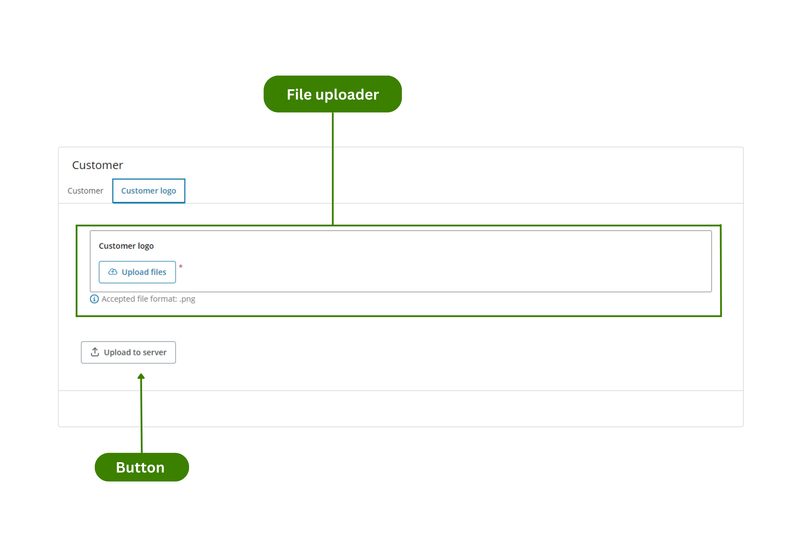
Configuration example
This example shows how to configure the Customer app (see Example of usage). Follow these steps to configure it:
-
Customer logo file uploader:
-
Drag the File uploader component to a previously added Layout component in the canvas.
-
Select the File uploader component in the canvas and go to the Properties panel.
-
Open the Main menu and configure:
- Component ID: Enter a meaningful name and select the Save button.
- Title: Enter the text you want to appear at the top of the component. For this example, Customer logo.
- Description: Enter the text you want to appear under the file uploader. Typically, if you have turned on the Restrict file formats switch, this will be the accepted file formats. For this example, 'Accepted file format: .png'.
- Restricted file formats: Turn on to specify which file formats are allowed. In this example, '.png'.
-
Open the Validation menu and configure:
- Required field: Turn on to make the component mandatory.
-
-
Upload to server button:
-
Drag the Button component to a previously added Layout component in the canvas.
-
Select the Button component in the canvas and go to the Properties panel.
-
Open the Main menu and configure:
- Component ID: Enter a meaningful name and select the Save button.
- Text: Enter the text you want to appear in the component. For this example, 'Upload to server'.
-
Open the Styles menu and configure:
- Icon: Choose an icon to be displayed before the text entered in the Text field.
-
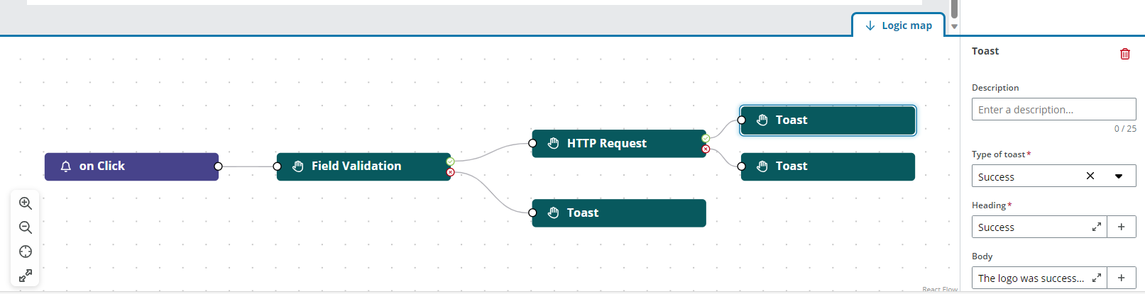
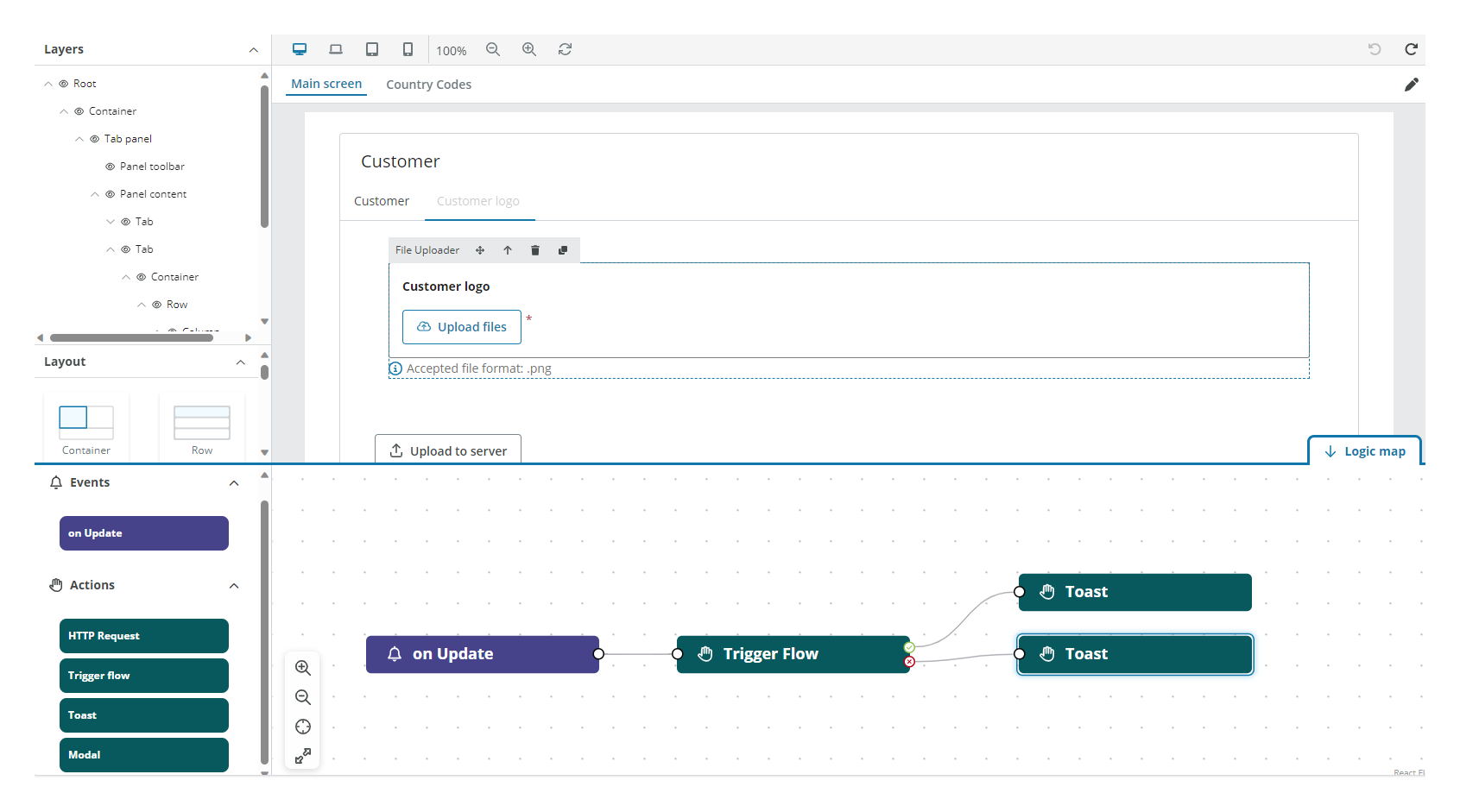
Open the Logic map tab in the bottom-right corner and configure:
- Drag the On click event to the viewport.
- Drag the Field validation action to the viewport and connect it to the On click event. This action allows you to configure the Required field property of the File uploader component.
-
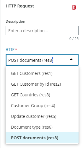
Drag the HTTP request action to the viewport and connect it to the Green check handle of the Field validation action. Select the Resource where you have configured the API call from the HTTP drop-down in the right panel. See how to use the attached files for more details.
-
Drag three Toast actions to the viewport. Connect them as shown in the picture and configure the Type of toast, the Heading and enter a text in the Body.
-
Note: Only the properties relevant to the example are explained.
Properties
The following File uploader properties are available:
Main
| Property | Description |
|---|---|
| Component ID | Enter a unique name for the component. See templating in components for more details. |
| Title | Enter the text you want to be displayed above the component. |
| Subtitle | Enter a text under the title to include extra details if needed. |
| Button text | Enter a text for the button, by default 'Upload files'. |
| Description | Enter a text line at the bottom of the component. The field is pre-filled for you to complete with the accepted file formats. |
| Restrict file formats | Turn on to allow only certain file formats. If turned off all formats are accepted. |
| File format | Enter the accepted file formats if Restrict file formats switch is turned on. For more than on extension separate with commas, for example '.jpeg, .pdf, .png'. |
| Maximum file size (MB) | Enter the maximum file size for the entire upload, including all uploaded files. Maximum allowed by App Studio is 60 MB. |
| Minimum files | Enter the minimum number of accepted files. |
| Maximum files | Enter the maximum number of accepted files. 10 is the maximum. |
Note: See Templating drop-down for more details on rendering dynamic content using Liquid.
Validation
| Property | Description |
|---|---|
| Required field | Turn on to make the component mandatory. By default, the component is optional. |
| Add rule | Add rules in Liquid to specify when the component is required. If no rules are set, the component will be required in all instances. See add rules to trigger properties for more details. |
| Message | Enter a message to be displayed if the user does not fill in the input. A default message is otherwise shown. |
Interactions
| Property | Description |
|---|---|
| Hidden | Select the checkbox to hide the component in the end-user app. You can set rules to hide the component using Liquid. The rules are only available when hiding the component with the checkbox not when hiding the component from the canvas with the Eye icon in the Layers panel. |
| Disabled | Select the checkbox to disable the component in the end-user app. You can set rules to disable the component using Liquid. |
Note: See add rules to trigger properties for more details on setting rules to these properties.
HTML
| Property | Description |
|---|---|
| Aria label | Enter a text designed to help assistive technology attach a label to the text input. |
| Title | Enter a text to be displayed as a tooltip when hovering the mouse over the component in the end-user app. |
| Tab index | Enter the navigation order for keyboard navigation. |
Events
The File uploader component supports the On update event. See events and actions for more details.
How to use the attached files
To use the files attached by the users you must configure them in the Resources tab. We can configure the following resources:
- HTTP
- ERPx API
- Flow
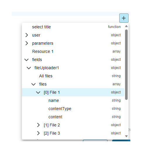
Inside the Content definition section of the resource you can:
-
Enter the Liquid formula inside your JSON by hand, for example,
{{fileUploader1.files[0].content}}. -
Select the Plus (+) button to display the Liquid template drop-down:
- Open the Fields drop-down.
- Open the File uploader you need. For example,
fileUploader1.- To use all files: Select
All files. - To use specific properties of the file: Open the file you want to use. For example,
[0] File 1. Select the property or properties you want to use depending of the API you are using:namecontentTypecontent
- To use all files: Select
Note: The file position in the array is randomly assigned, to have control over which specific file you are selecting it is recommended to use different File uploaders. All files are encoded in Base64.